Vibe coding is fun, especially because AI tools promise to take your ideas from prompt to product in minutes. I’ve seen Lovable and V0.dev come up again and again in conversations about fast prototyping, design-to-code workflows, and building beautiful UIs without sweating the frontend.
So I decided to test both.
The goal is to try them out for vibe coding and build a few real apps, while tracking how much control, speed, and creative freedom each tool gives.
In this article, I’ll take you through my process of using both tools to build apps. I promise my setup is nothing serious, after all, it’s vibe coding. The tools will be doing most of the work.
Let’s see how they perform.
Lovable overview
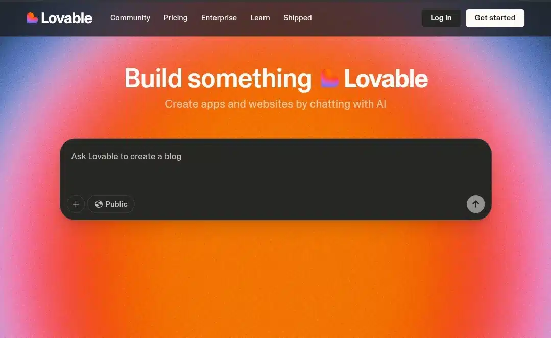
Lovable is an AI app builder that turns natural-language prompts into fully working web applications, not just frontends, but actual full-stack setups with authentication, databases, and deployable code. Built for vibe coding and rapid prototyping, it generates clean React + Tailwind UIs, handles backend logic using Supabase, and supports GitHub export or direct editing.
Lovable’s interface is minimal, intentionally distraction-free, and encourages fast iteration. You can remix public projects, import screenshots or Figma files, and guide the AI with follow-up prompts to refine layout and functionality. It’s ideal for bootstrappers, indie hackers, and early-stage founders who want to go from idea to live app without spending days wiring up boilerplate.
While it works well for non-coders, Lovable still assumes some level of technical understanding, especially when tweaking or debugging outputs. With over 30,000 paying users and fast-growing traction, it’s positioned as a serious tool for both fast builds and experimentation.
Lovable Features
- Prompt-to-App Generation: Type what you want to build (e.g., “a dashboard with login and charts”), and Lovable generates a full-stack app using React, Tailwind, and Supabase.
- Backend Integration: Supports Supabase for authentication, database, and backend logic — letting you build apps that aren’t just pretty but functional.
- Source Code Access: Download the entire codebase (frontend and backend) or push directly to GitHub for version control or manual tweaking.
- Remixable Projects: Browse public apps made by others, remix them instantly, or use them as a starting point for your own.
- Screenshot + Figma Import: Generate UI from a screenshot or Figma file and edit the result through prompts — handy for visual thinkers.
- Real-Time AI Editing: Refine structure, layout, or features with follow-up prompts. For example: “Make the header sticky” or “Add a dark mode toggle.”
- Minimal UI, Fast Iteration: The interface is stripped down to focus purely on building. It’s responsive, fast, and designed for flow state.
- Built for Vibe Coding: Encourages experimentation and fast builds without worrying about breaking stuff — great for idea dumping and low-pressure development.
V0.dev overview
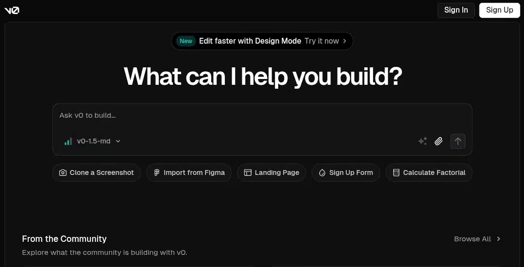
V0.dev, built by Vercel, is a chat-based AI tool that converts natural-language prompts (or screenshots/Figma designs) into production-ready UI code—primarily using React, Next.js, and Tailwind CSS, often with Shadcn UI components. Unlike full-stack generators, V0 focuses on delivering high-fidelity frontend scaffolding you can refine via conversation—add features, tweak styles, or integrate APIs—right within the interface.
You can export working Next.js projects, push them to Vercel with one click, and pull in integrations like Supabase, Blob storage, edge functions, and AI models. It supports responsive design, live previews, and customization at both component and project levels. V0.dev suits both non-coders for rapid prototyping and experienced developers for cutting boilerplate, although backend logic must be handled separately.
The platform offers a free tier and paid plans ($20/mo Premium, $30/user Team), with credits, expanded usage, Figma imports, and collaboration tools.
V0.dev Features
- Prompt-Based UI Generation: Describe what you want (e.g., “a dashboard with charts and sidebar”) and V0 generates responsive React + Tailwind components instantly.
- Shadcn UI Integration: Uses Shadcn component library for clean, accessible, and customizable designs — ideal for production-grade UIs.
- Next.js Support: Outputs structured Next.js projects, ready to edit or deploy directly on Vercel.
- Live Editing & AI Tweaks: You can chat with the AI to make layout changes, add components, or adjust styles — no need to rewrite entire prompts.
- Figma & Screenshot Input: Upload a Figma file or screenshot, and V0 will try to generate matching UI code from the design.
- One-Click Vercel Deployment: Instantly deploy generated apps to Vercel, making it easy to go live or preview on the fly.
- Component-Level Control: Edit or regenerate specific components without touching the rest of your layout
- API & Backend Hooks: Supports adding fetch requests, form handlers, and connecting to APIs (though full backend logic is left to the dev).
- Collaboration Tools: Premium users can invite team members, comment on changes, and manage iterations across projects.
- Flexible Export Options: Download code locally, push to GitHub, or sync directly with your existing Next.js repo.
My Setup
I kept things simple on purpose. Since this is vibe coding, I wanted the tools to do most of the work. All I needed was:
- A laptop
- A browser (Chrome)
- An open mind and a bit of time
No VS Code. No local installs. No backend prep. I didn’t bring in any design files either.
Both Lovable and V0 were tested in the browser, and I used the free tier for each to keep things realistic for casual use or early-stage projects.
The Apps we’ll be building
To get a fair sense of how Lovable and V0 handle different kinds of builds, I picked three apps, each with increasing complexity. These will help test layout generation, component logic, responsiveness, and how far I can go before needing to touch code.
- Simple Landing Page (Beginner Level)
A clean, responsive marketing page with a hero section, features grid, testimonial block, and call-to-action. This will test how well each tool handles layout, spacing, and basic UI polish with minimal logic involved.
- Job Board (Intermediate Level)
A functional job listing app with a homepage, filtering system, individual job detail pages, and a basic “post a job” form. This will test data rendering, forms, basic routing, and UI components working together.
- AI Writing App (Advanced Level)
An app where users can type a prompt and get AI-generated output (via OpenAI API), with login, saved documents, and editable results. This pushes the tools on real API integration, auth, and multi-step logic — the kind of project you’d usually scaffold manually.
App 1: Simple landing page
We’re starting with the basics: a clean, responsive landing page. I don’t need complex logic here, just solid layout, nice UI, and good structure. This is the kind of thing you’d spin up quickly for a product launch, waitlist, or SaaS announcement.
Here’s the exact prompt I used on both tools:
“Create a responsive landing page for a productivity app. Include a hero section with a headline and subtext, a features grid, a testimonial section, and a call-to-action at the bottom.”
The goal here is to see how well Lovable and V0 handle layout, spacing, design quality, and component arrangement right out of the box, with minimal edits.
Lovable’s Result
I have no complaints! I wanted a simple landing page for my productivity app and that’s exactly what I got. Every section I requested was right there: the hero with headline and subtext, a clean feature grid, testimonials, and a solid call-to-action at the bottom.
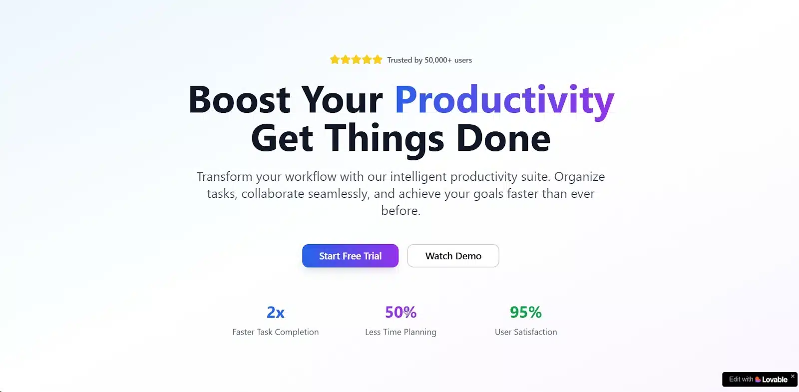
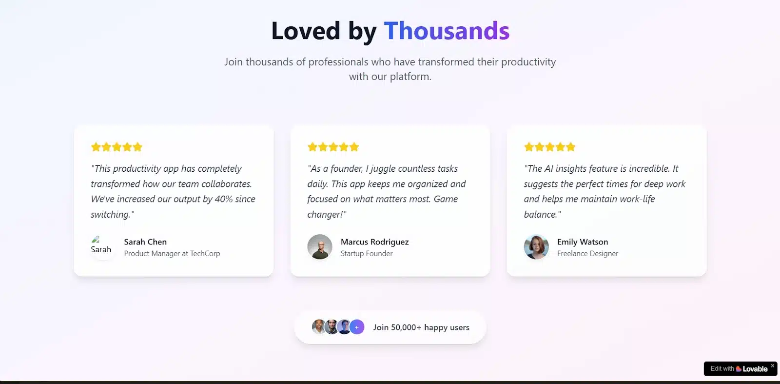
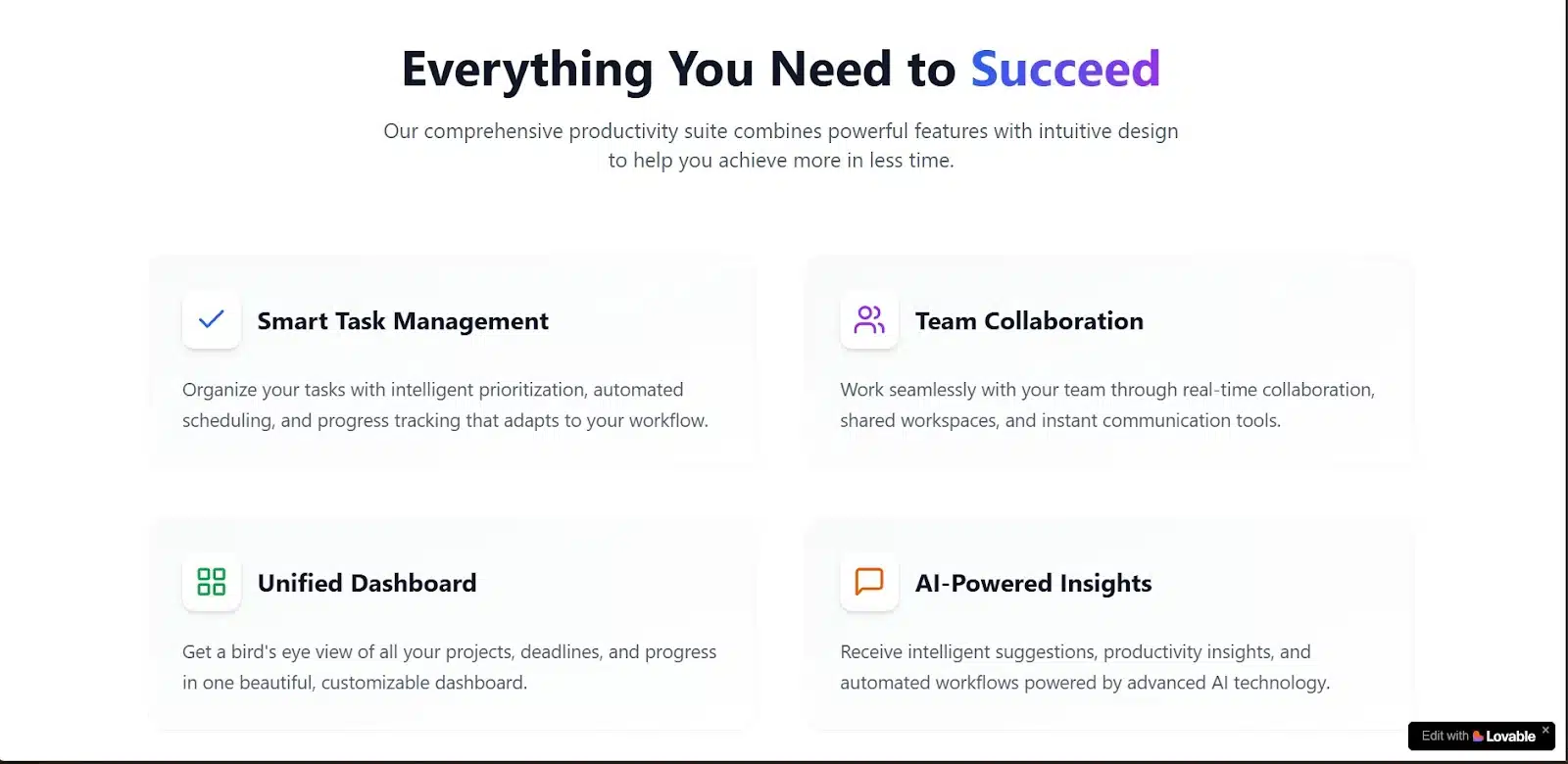
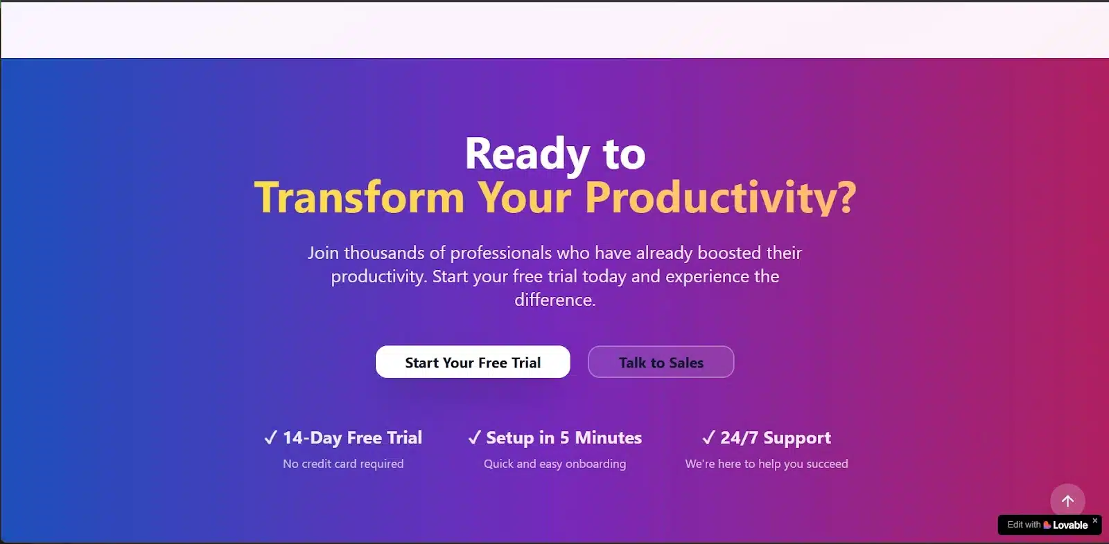
Visually, it matched the productivity vibe well. The color palette was clean and muted and the fonts felt on-brand for something you’d expect from a productivity tool. It looked polished right out of the gate.
On responsiveness, it loaded smoothly on mobile, but the layout felt a bit choked. Sections were stacked a little too tightly, and there wasn’t enough breathing room between blocks. It’s not broken, but it’s a little overwhelming if you’re viewing it on a smaller screen.
Code-wise, it looked decent. A dev might want to clean up a few things for reusability or tweak the layout spacing for better responsiveness, but for a fast MVP or quick launch, it holds up really well.
V0’s Result
V0 came through with something even more structured and, honestly, more polished in terms of layout logic. While it didn’t use as much color as Lovable, the overall feel still fit a productivity brand well. Clean, clear, and confident.
Beyond the sections I requested, V0 gave me more than expected: a sticky header with shortcuts to key pages — features, testimonials, pricing, sign in, and a “Get Started” button. It also added a well-organized footer with links to Product, Company, Resources, and Support. It felt like a complete SaaS landing page — not just a demo.
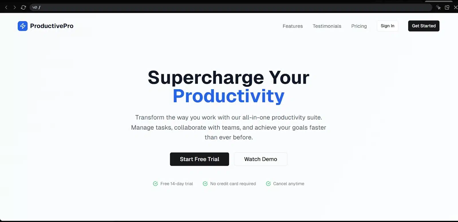
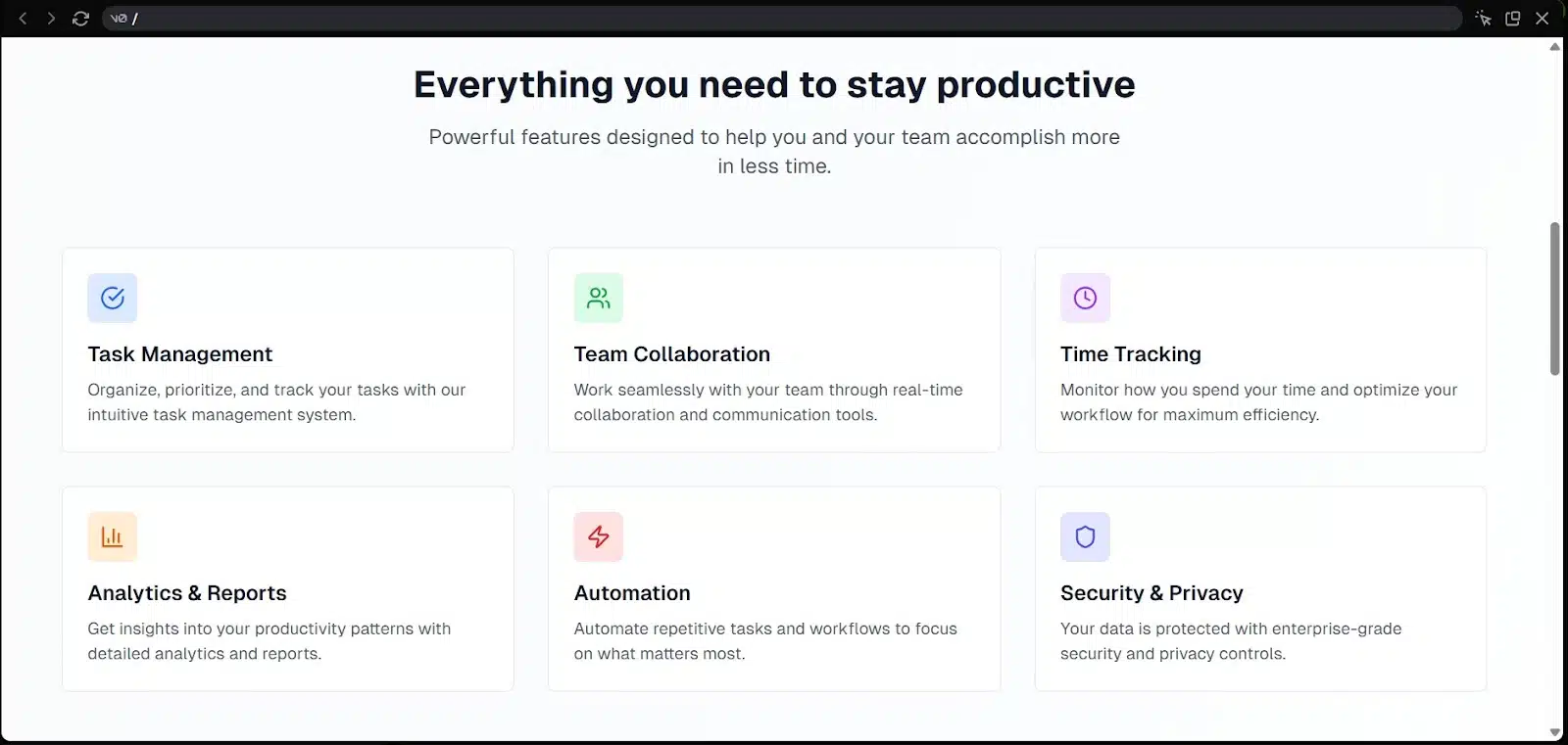
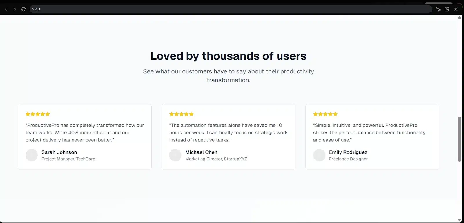
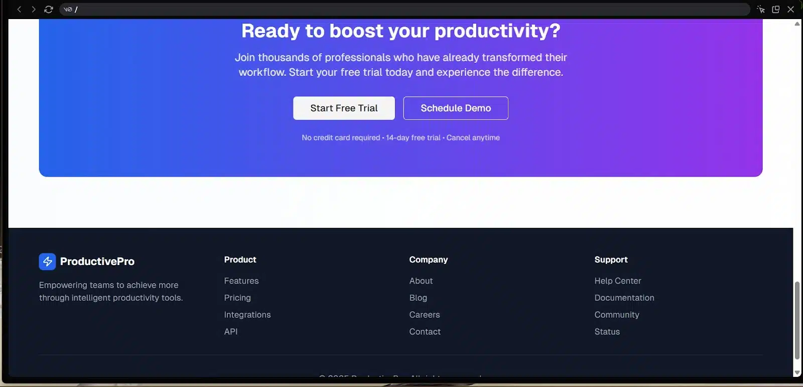
From a UX standpoint, the structure made sense. A visitor could quickly explore features, skim testimonials, and jump straight to pricing or onboarding. It wasn’t just a landing page; it guided you through the funnel. That’s smart design thinking, and it showed.
The copy was also surprisingly good. Catchy headlines, solid CTAs, and even a product name: ProductivityPro. That gave the whole thing a real identity instead of feeling generic.
On mobile, responsiveness was okay. Similar to what I got with Lovable, smooth loading, but the layout could benefit from a bit more spacing. Some sections felt slightly packed together, and small changes in padding or alignment would improve the mobile presentation.
Overall, V0 nailed structure and intent. The page felt ready to ship with just minor refinements.
App 2: Job board
Next up is something more functional — a job board. This moves us past static layouts and into a flow with components, content rendering, forms, and basic navigation. It’s still frontend-focused, but we’re now testing how these tools handle structure, interaction, and data.
Here’s the prompt I used for both tools:
“Build a job board with a homepage that lists available jobs, a filter by role or location, a button to post a new job, and a detail page for each listing.”
This one will show whether the AI can handle things like routing, filters, and a form-based UI — all without extra prompting or manual edits.
Lovable’s Result
Lovable named the app HireHaven, with the tagline “Find your dream job.” Sure, it’s generic, but it works as a placeholder and makes the interface feel more intentional from the start.
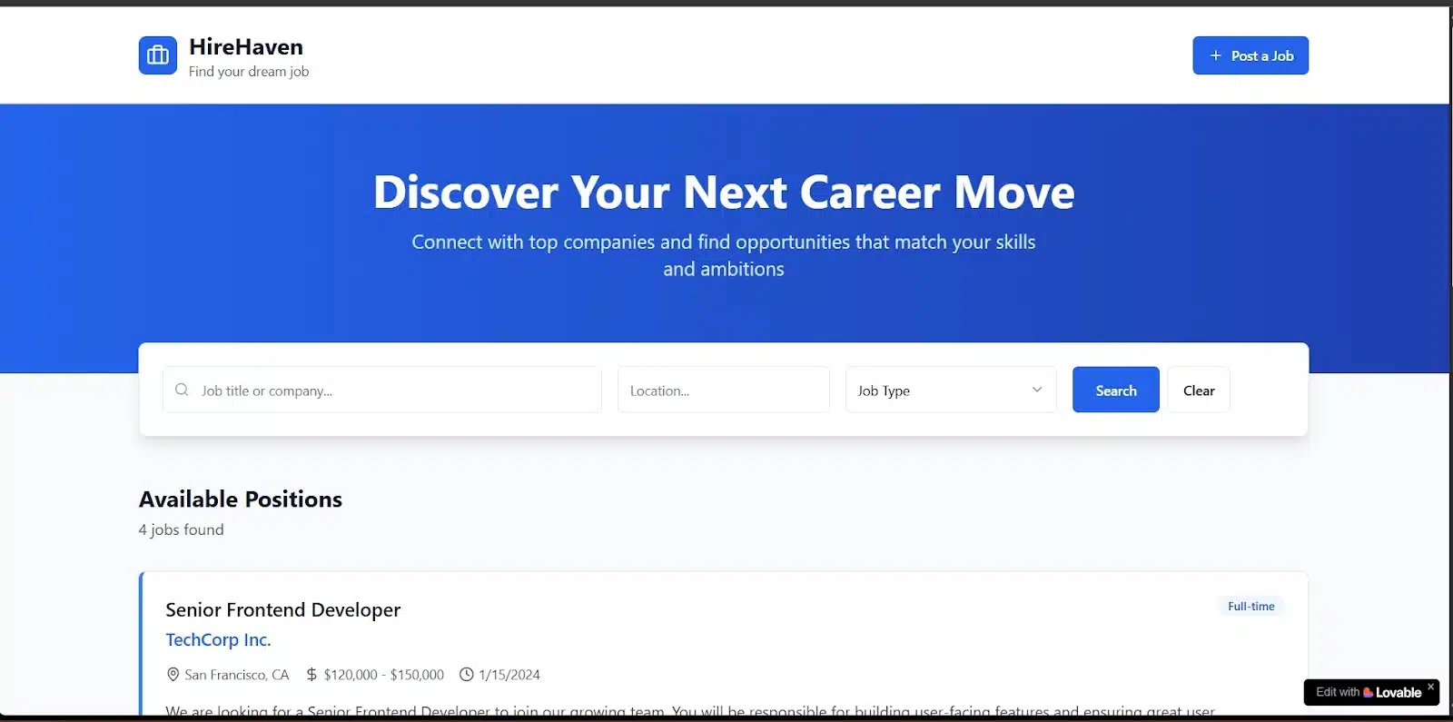
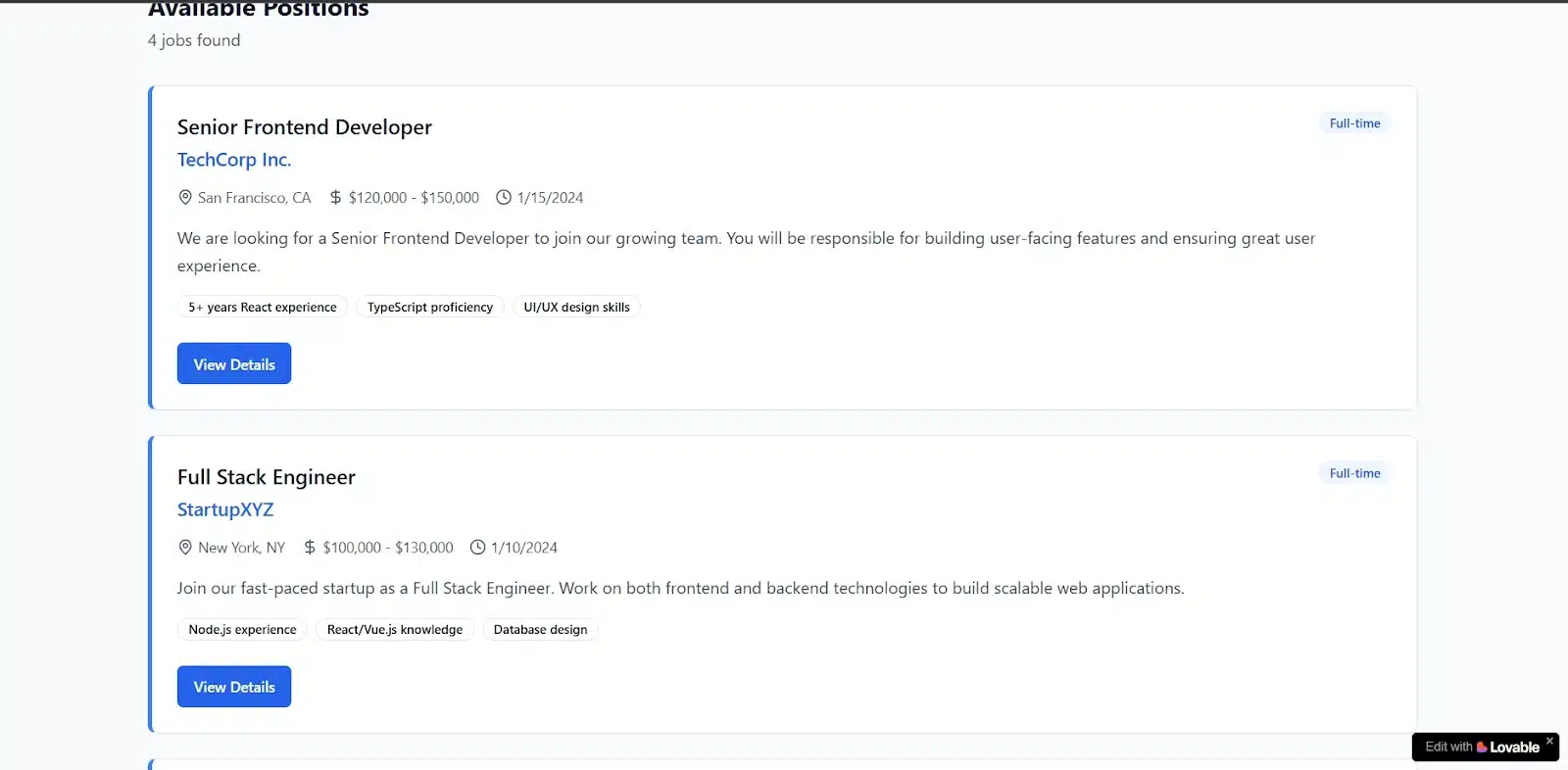
The overall layout felt right for a modern job board. It used a balanced mix of soft blues and white, which gave the site a professional but approachable tone. Font choices were solid too, clean and readable without trying too hard.
Functionally, Lovable paid attention to the right details. Each job card showed the job title, location, company name, salary range, time posted, and a few skill keywords at a glance. That kind of preview makes a big difference for usability. It’s the kind of thing users expect to see without clicking.
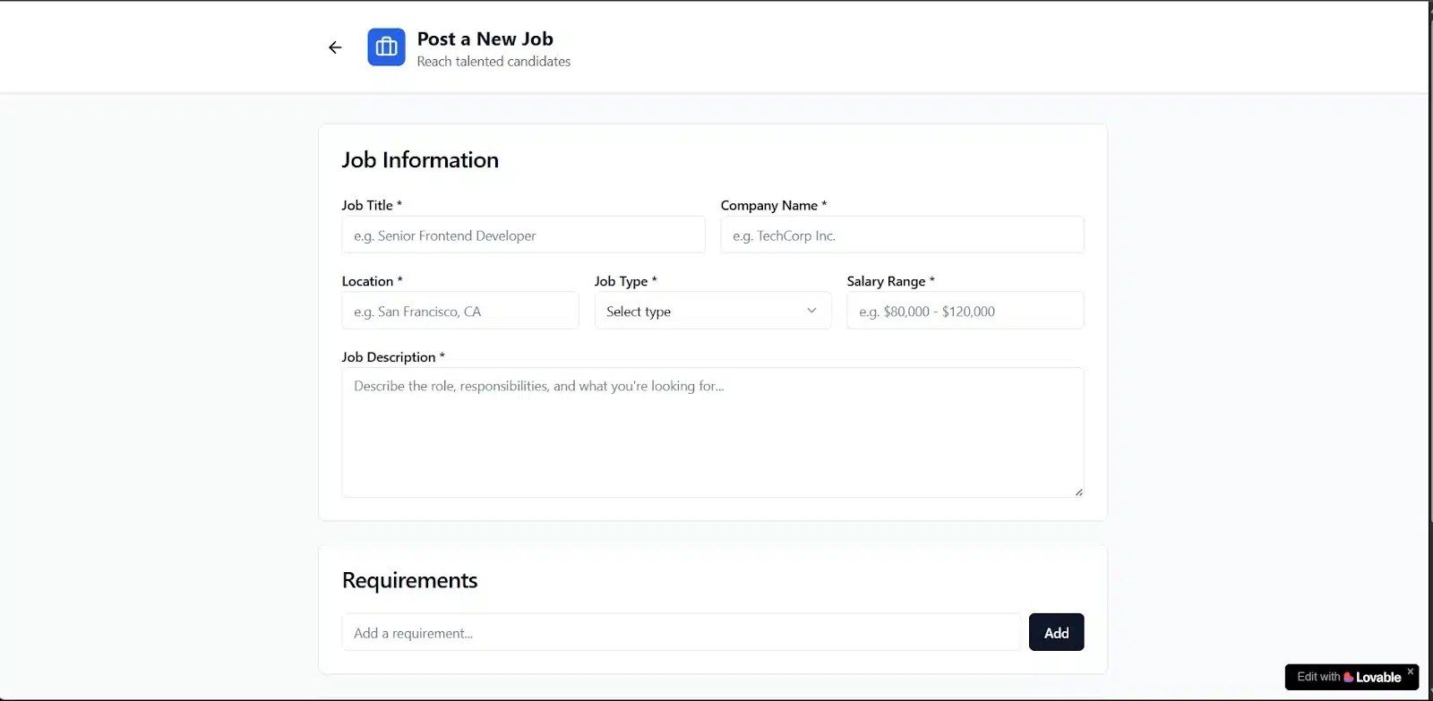
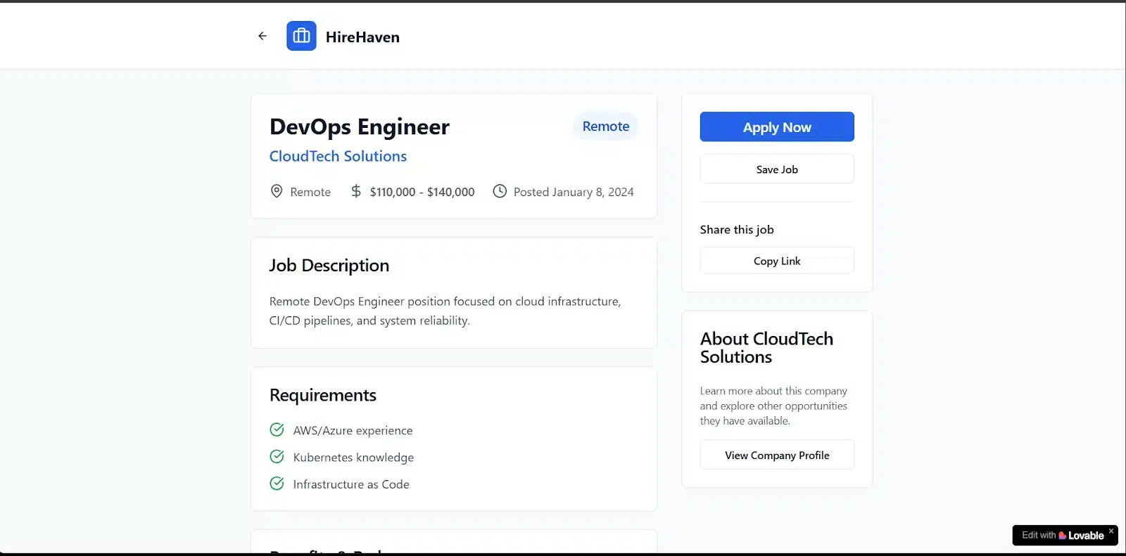
Interactivity was impressive. The “Post Job” button led to a working form, filters responded smoothly by role and location, and clicking a job opened a full detail page. Each listing included more information about the job, an apply button, a save option, and even details about the hiring company.
Mobile experience was also solid. Navigation between pages was clear, buttons were responsive, and each screen felt clean and distinct. It was genuinely usable on a phone.
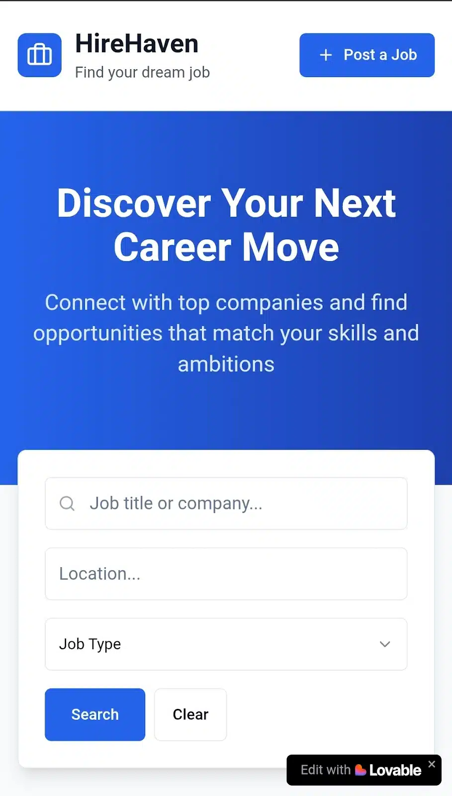
Overall, it felt like a functional, user-ready MVP. Lovable delivered something you could easily tweak and ship with very little overhead.
V0’s Result
If Lovable leaned optimistic, V0 went full melancholic because the entire job board came out in black and white. It was clean, though, and visually simple in a good way. You could always prompt it to change the color scheme or just adjust it in the code later, so this wasn’t a deal-breaker, more of a stylistic choice.
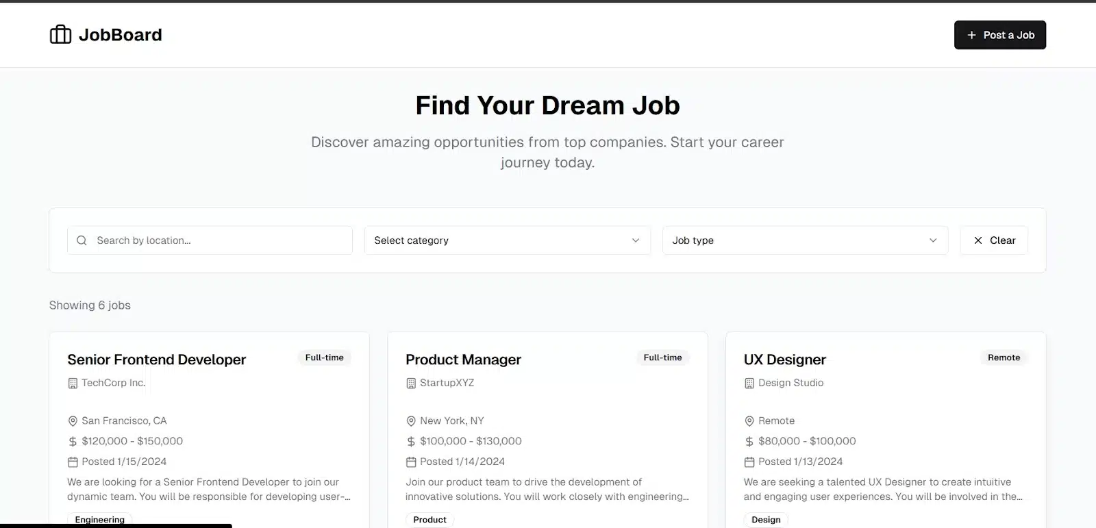
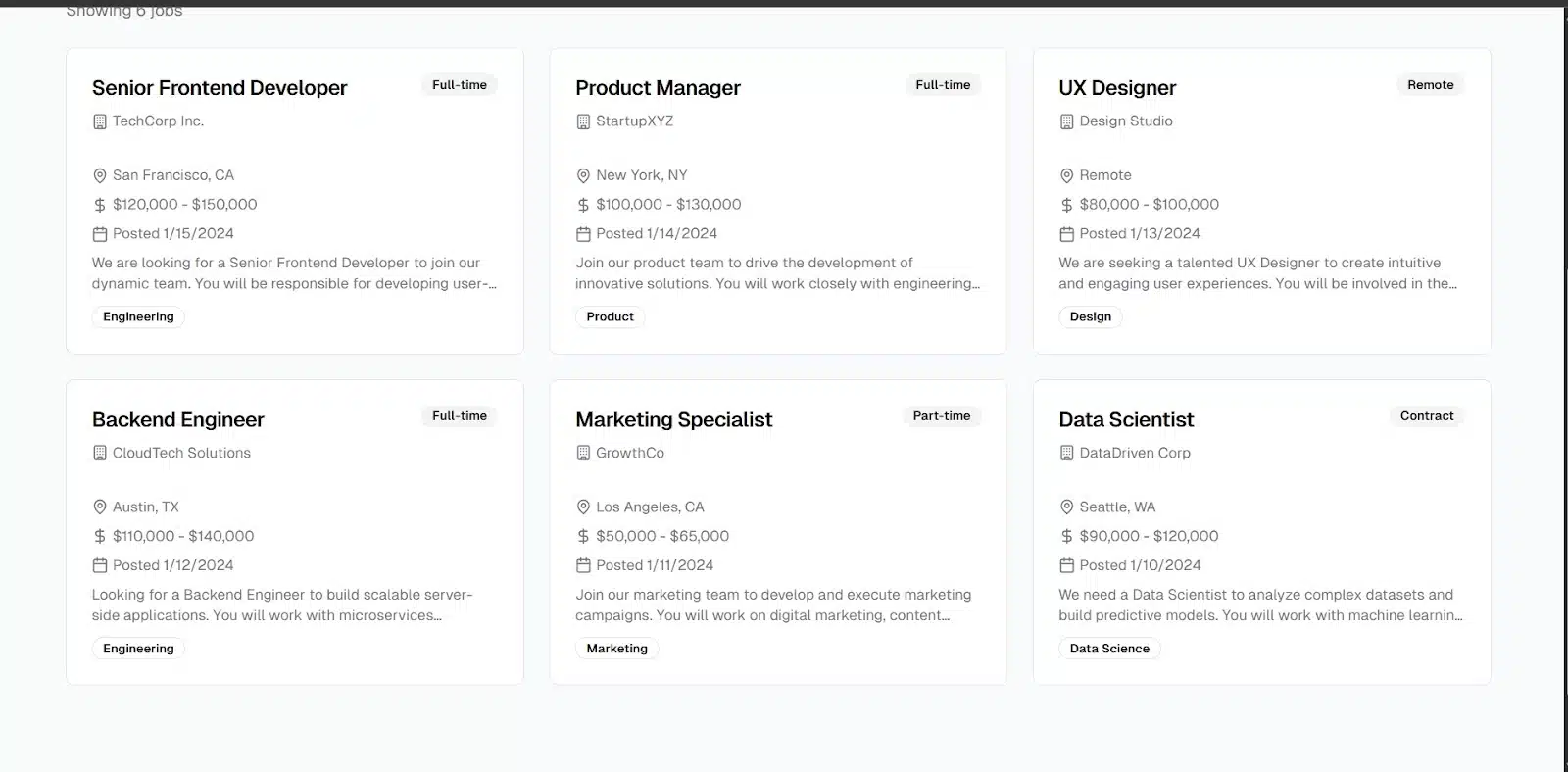
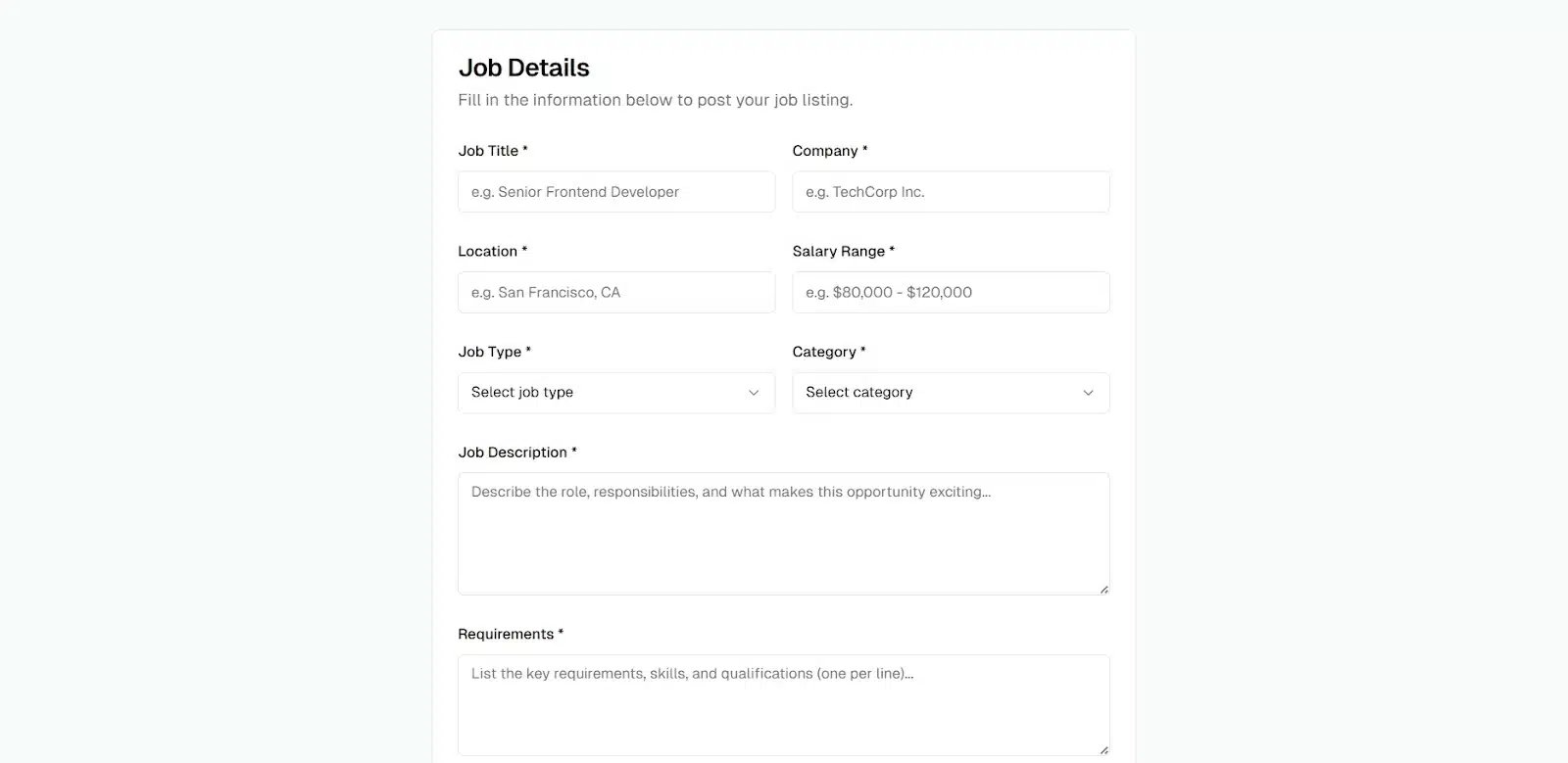
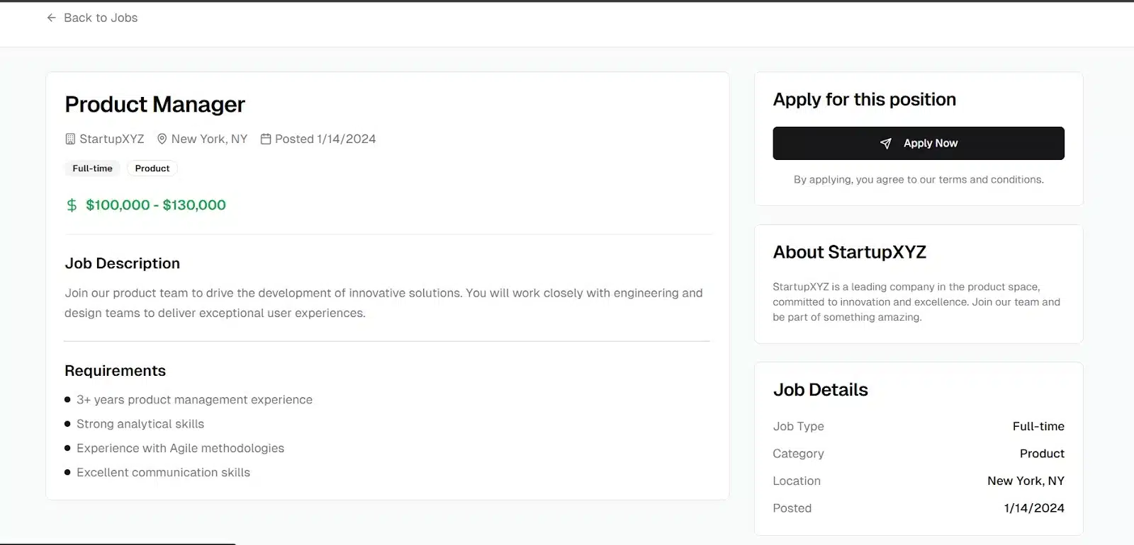
The layout itself was very similar to what Lovable gave. A homepage listing jobs, a clear “Post a Job” button, and proper routing between views. Clicking on a job took me to a dedicated detail page, and the “Post Job” button opened a form that felt usable, even in this barebones state.
Just like with Lovable, job listings included the important stuff at a glance — location, salary range, date listed, and skill keywords. The information hierarchy made sense and felt intentional. You didn’t have to dig to understand what each role was about.
The mobile experience was also solid. It reminded me of early versions of sites like Indeed — straightforward, minimal, and focused on content. Pages were well-separated, buttons responded smoothly, and the whole experience held up without any hiccups.
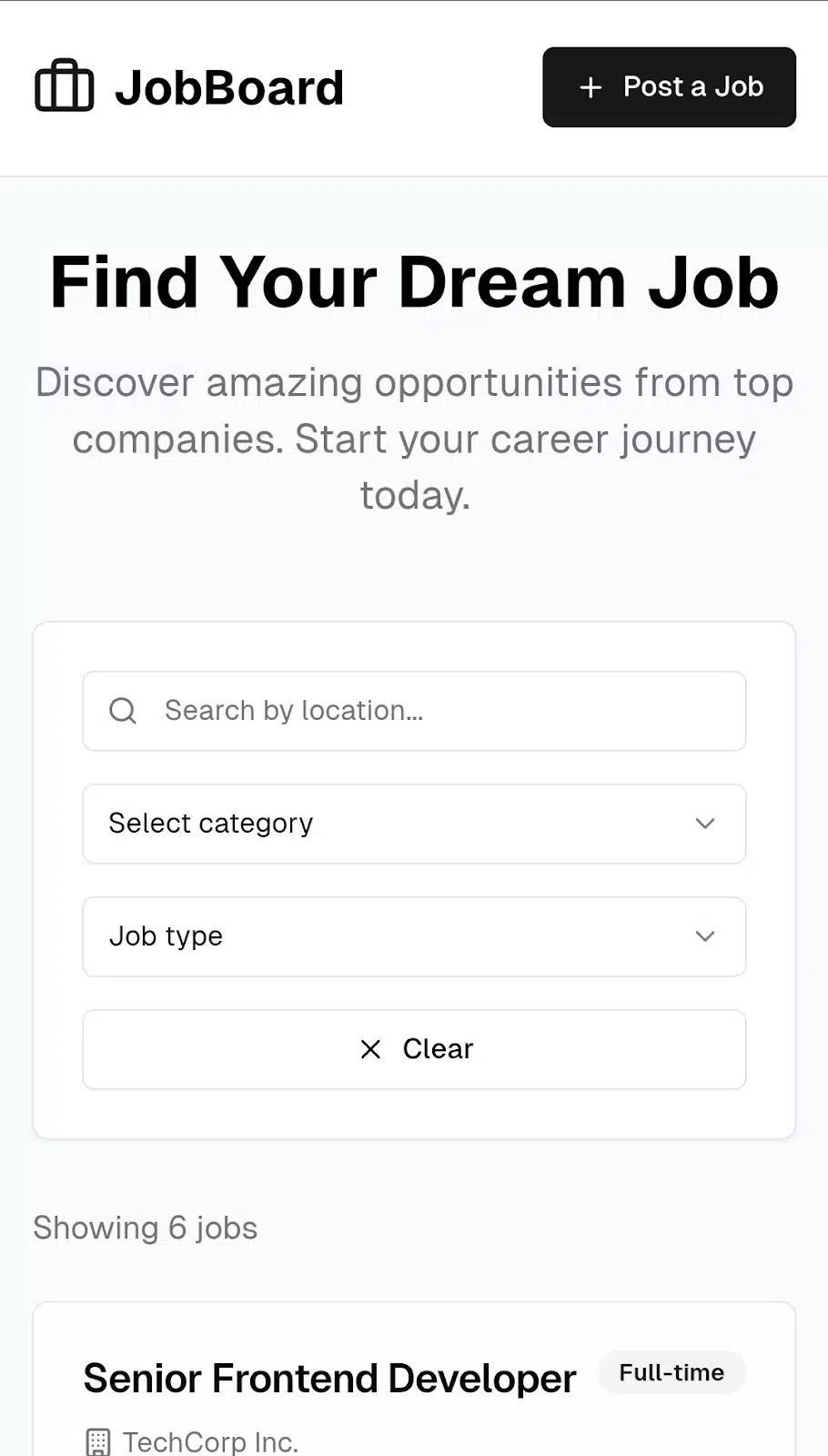
Overall, V0 delivered a clean and functional job board. While it didn’t offer much visual flair out of the box, everything worked, and the foundation was there for customization and polish.
App 3: AI writing app
For the final test, I wanted to push both tools a bit further beyond static content and into something interactive and dynamic. An AI writing app is a great way to do that. It brings in user input, API calls, user accounts, and saved content: all the things you’d need for a real tool.
Here’s the prompt I used:
“Build an AI writing app where users can input a prompt, generate content using OpenAI’s API, log in to save their drafts, and view a list of previously saved documents.”
This prompt tests more than just layout. It checks how each tool handles user flows, form submissions, authentication, and external API integration — or at least how far it gets before you need to jump in and connect the dots manually.
V0’s Result
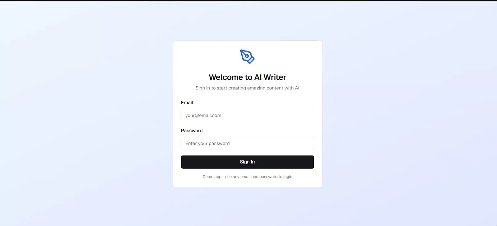
This time, I started with V0. The app began with a login page, and I was able to sign in using test credentials.
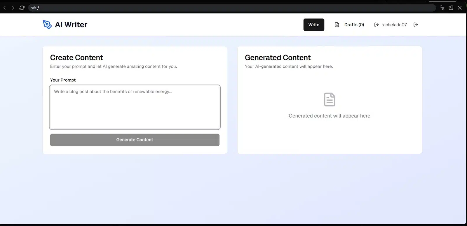
After logging in, I was taken straight to the writing interface — a clean, focused space where I could enter a prompt and ask the AI to generate content. So I did. But of course, it needed an OpenAI API key to actually complete the request. Fair enough.
I grabbed a key, added it, and hit generate. That’s where things fell short. I got an error after three failed attempts:
“Server error. Error generating content: failed after 3 attempts.”
The last error said I had exceeded my quota on OpenAI, which I guess I did. I wasn’t planning to upgrade my key, so I left it there.
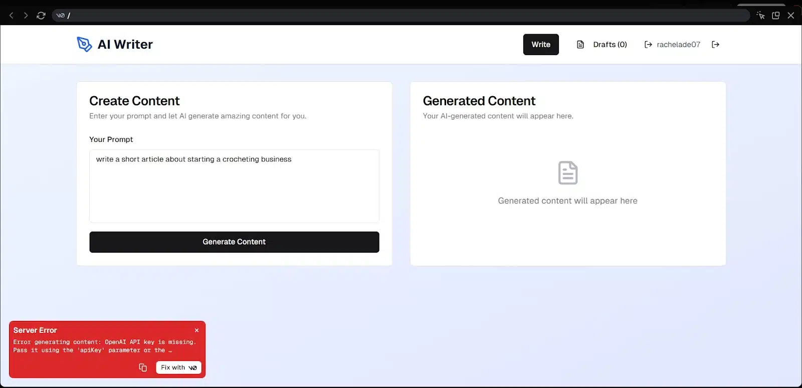
Even though the content generation didn’t work, everything else did. Navigation was smooth. The app handled transitions between pages cleanly, and all the buttons behaved like they should. Mobile version? No complaints — the layout held up nicely, and interaction was fluid.
Overall, V0 gave me a solid app shell. The experience felt real, even with the API roadblock. If I had a working key or a backend to connect, this app could easily move from test to production with just a bit of wiring.
Lovable’s Result
Unfortunately, I didn’t get much from Lovable on this one. After it finished generating the app, all I got was a blank screen.
In the chat, Lovable explained that I needed to add a Clerk publishable key in the environment for authentication to work. It also mentioned that I should export the code to GitHub and set things up manually to see it in action.
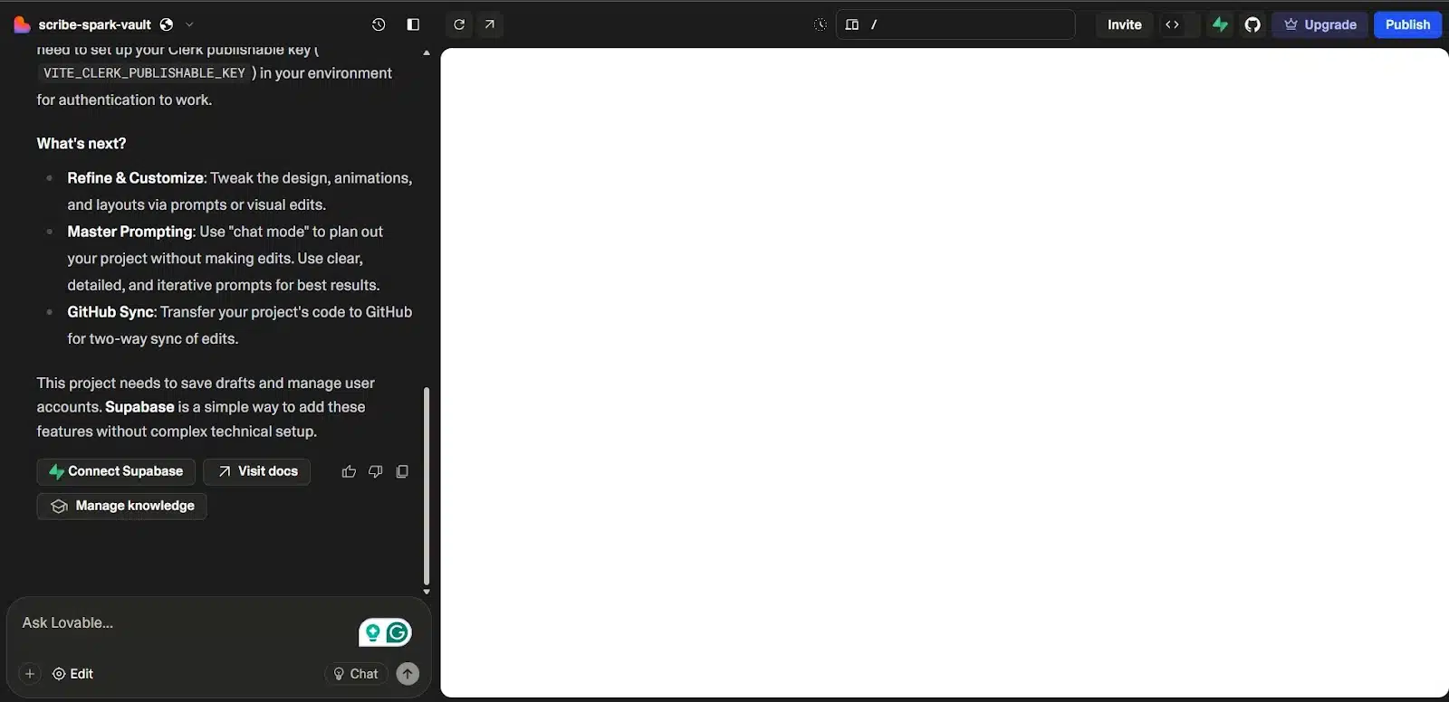
At that point, I stopped.
This article is about vibe coding, and if I have to start digging into environment variables, setting up Clerk, and editing files just to preview what was generated, it defeats the purpose. The whole idea is to get quick results with minimal setup. Lovable might have built something functional under the hood, but I wasn’t able to interact with it at all inside the tool.
So overall, Lovable didn’t deliver a usable app in this case. It probably gave me code I could work with, but for vibe coding, it fell short.
Lovable vs V0: side-by-side comparison
| Feature/Aspect | Lovable | V0.dev | Winner |
| Ease of Use | Very beginner-friendly, clean interface, prompt-first flow | Also easy to use, but with more UI controls and flexibility | Tie |
| Landing Page Output | Great layout, polished colors and fonts, good mobile view | Clean structure, better UX flow, full nav + footer included | V0.dev |
| Job Board Functionality | Impressive detail and interactivity, visually pleasing | Functional, minimal styling, but all parts worked smoothly | Lovable |
| AI App (Advanced) | Blank screen; setup required to preview or test | Login flow worked; API error due to key quota, but structure solid | V0.dev |
| Mobile Experience | Responsive but some elements felt tightly packed | Equally responsive; layout slightly more spaced | V0.dev |
| Code Quality | Clean, production-ready, with React and Supabase | Modular, editable, uses Next.js + Shadcn UI | Tie |
| Copywriting/UX | Generic but usable placeholders | Catchy copy + generated product name (ProductivityPro) | V0.dev |
| Customization Options | Can prompt changes, remix public projects, or export code | Component-level control and live AI editing in chat | V0.dev |
| Authentication Setup | Requires Clerk + environment variable setup | Built-in sign-in is working by default on test app | V0.dev |
Overall winner: V0.dev
While Lovable held its own on simpler apps, especially the job board, V0.dev was more consistent across all levels. It handled layout, user flow, and navigation with intention, and while its AI writing app didn’t fully generate due to the API quota, the infrastructure was there and usable.
Lovable works when you want fast results with minimal thinking, but once things get technical, it starts requiring more manual effort. V0.dev, on the other hand, gave more structure out of the box, even if it looked plainer.
Final thoughts
Both Lovable and V0.dev make building apps feel less intimidating, especially when you’re just trying to get something working without spending hours wiring things together.
Lovable felt friendlier at first, and for quick UI ideas or mid-fidelity prototyping, it gets the job done fast. But once I pushed into more complex builds, V0.dev offered a stronger foundation. It didn’t just generate screens, it gave me a working flow, real structure, and code I could build on.
That said, both tools are evolving fast. What feels like a limitation today might be fixed in the next release.
Have you tried either of them? Got a favorite? Drop your thoughts, frustrations, or successes in the comments. I’d love to hear how these tools worked for you or if you’ll be testing them out after reading this.

