These days, you don’t need to know how to code to build an app. All you need is a good idea and the right AI tool to bring it to life. Platforms like Replit vs V0 are making that possible with vibe coding. Simply type what you want, make adjustments as needed, and let the AI handle the more complex tasks.
I’ve been testing a few of these platforms lately. In my last comparison, I put Replit and Lovable side by side for vibe coding, and this time, I’m doing the same with Replit and V0.
Replit offers a full coding workspace with Ghostwriter, its AI assistant, to help you code in real time. V0 focuses on frontend UI generation. You type in a prompt, and it generates a responsive layout using React and Tailwind.
In this article, I gave both platforms the same prompts and tested how well they handled different app ideas. So, how do they really compare when you’re in the zone and just want to build without friction?
Let’s find out.
Introducing Replit
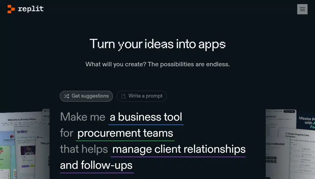
Replit is a browser-based development environment known for combining a full IDE experience with powerful AI-driven assistance. Since launching in 2016, it has evolved into a platform that supports over 50 programming languages, real-time collaboration, integrated hosting, database support, GitHub integration, and zero‑setup deployment.
Most of its AI power comes from Ghostwriter, introduced in late 2022. Ghostwriter offers:
- Complete Code: Context-aware, in-line code suggestions as you type
- Generate Code: Produce functions or entire components from prompts
- Explain & Transform: Break down existing code in plain language or rewrite it per your instructions
- Real-Time Feedback: Highlights bugs and suggests fixes proactively
Ghostwriter integrates deeply with Replit’s IDE—no extensions required and supports collaboration too, so multiple users can work alongside AI in real time. The results are rapid prototyping, seamless onboarding for beginners, and a smoother experience for experienced developers alike.
Introducing V0
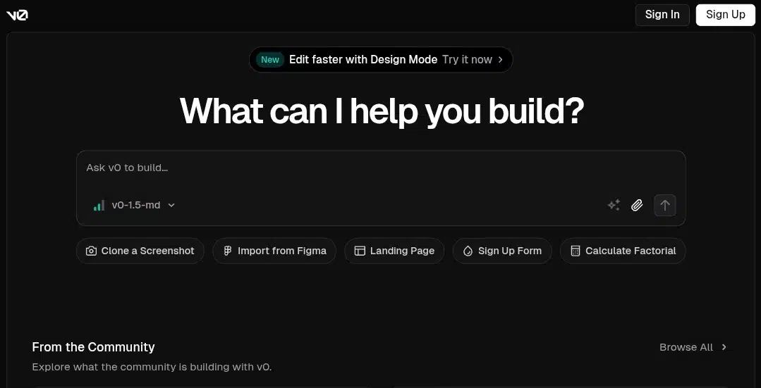
V0 (by Vercel) is a chat-based, AI-driven programming platform designed to transform natural language prompts into complete frontend UIs typically using technologies like React, Tailwind CSS, and Shadcn UI components. Rather than asking for a plan first, V0 immediately generates working code and a live preview as soon as you hit enter, making it ideal for rapid prototyping.
Here’s what stands out:
- Instant UI Builds: Type in your app idea and V0 builds fully interactive components right away.
- Editable Code & Preview: It renders both the UI and the underlying React/Tailwind code, which you can tweak or refine.
- Iterative Workflow: You can continue updating your app via follow-up prompts, like “add dark mode” or “include login flow.”
- Deployment Ready: Each project is tied to Vercel: one click and you’re live.
- Smart Add‑Ons: It integrates with Supabase, Blob storage, Redis, feature flags, and more.
- Figma + Screenshot Imports: Bring in design assets to jumpstart your UI.
According to developers on Reddit, they appreciate its speed and output quality:
“I love the free version… It create[d] some great UIs for me that I can plug in. It was better and faster than I could do it.”
“I use it to give it a data schema and ask it to generate charts for me… it is pretty good for that matter.”
My setup
To keep things fair, I used both tools in the browser on the same PC with a stable connection and a regular Chrome window. I didn’t use any plugins or extra extensions. I wanted to see what each platform could do right out of the box.
I used the free versions of both Replit and V0. The prompts I provided were straightforward. There were no detailed specs or a wireframe.
The goal wasn’t to perfect the apps, but to observe how each platform handled interpreting the prompt, generating a working result, and how easy it was to edit or continue from there.
The apps we will build
To test both tools fairly, I picked three app ideas with increasing levels of complexity. Each one was built from a single prompt, and both platforms received the same input.
Here’s the lineup:
- Mood Tracker: A simple app with emoji buttons and a textbox to log how you’re feeling each day.
- Recipe Finder: A mid-level app with a search bar, filters for ingredients or meal types, and recipe card results.
- Budgeting Dashboard: A more advanced app that includes a form to add expenses, category filters, and a monthly summary chart.
This mix covers basic UI, moderate interactivity, and apps with more structure. Let’s see how each platform handled them.
App 1: mood tracker
We’re starting simple. This app focuses on basic UI generation and minimal logic. The idea is to let users log how they feel using emoji buttons and optionally leave a short note. It should display the selected mood for the day, nothing more.
Prompt:
Build a mood tracker with emoji buttons to select your mood and a textbox for optional notes. After selecting, show today’s mood and note.
Mood Tracker on Replit
Replit started strong. It gave me a full breakdown of the app before generating anything: features, layout, and even a name: “Mood Mirror.” I liked that. The plan included emoji buttons for mood selection and a notes section to log how you’re feeling. Visually, it looked promising, so I approved it.
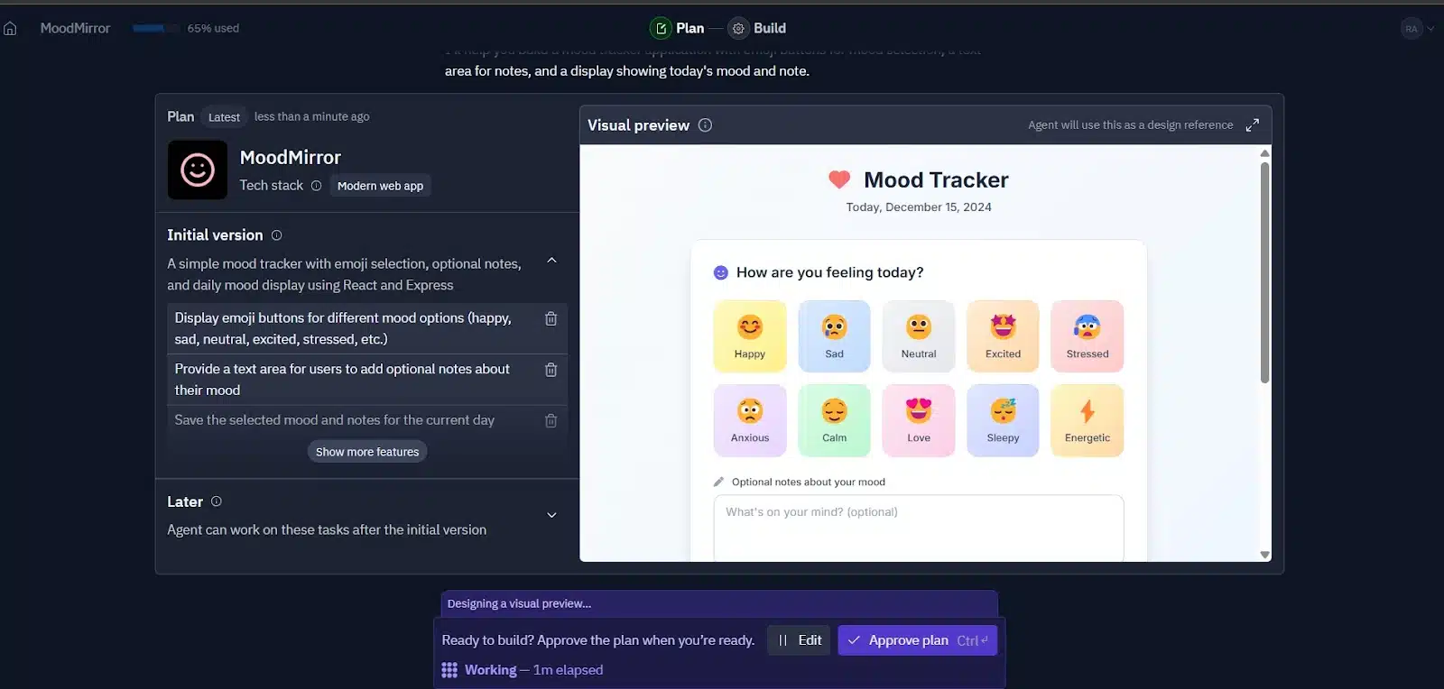
The build process took a few minutes, about two to generate the code and one more to render the app. Once it loaded, I tested it right away.
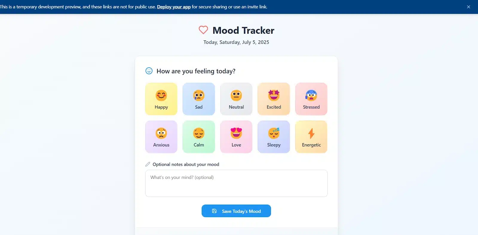
I selected a mood, added a note, and hit save. It worked. My entry showed up under “Today’s mood,” and the buttons responded just fine. But that was it. I couldn’t log more than one mood. When I tried recording another, the first one disappeared.
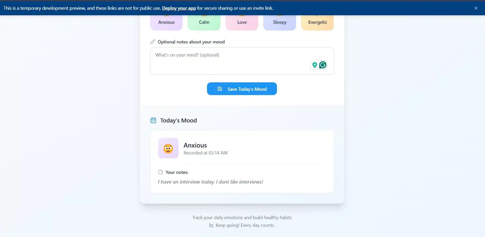
So I gave Replit more instructions:
- Let me select multiple moods
- Don’t override previous entries
- Add some quick stats
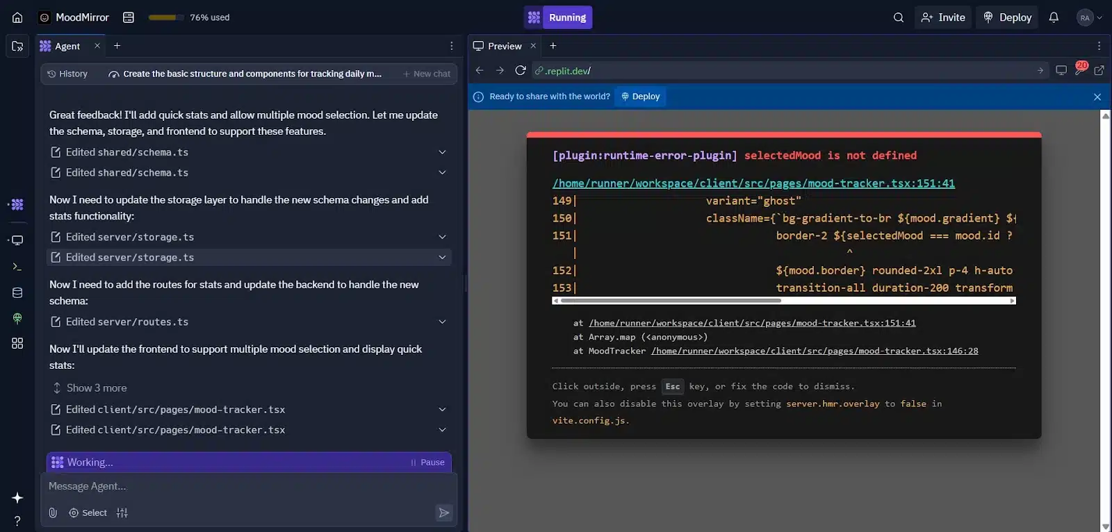
Replit updated the schema and rebuilt the app in about two minutes. There was no visible stats section at first, but the interface now allowed multiple mood selections. When I saved them, the quick stats popped up just above the emoji buttons.
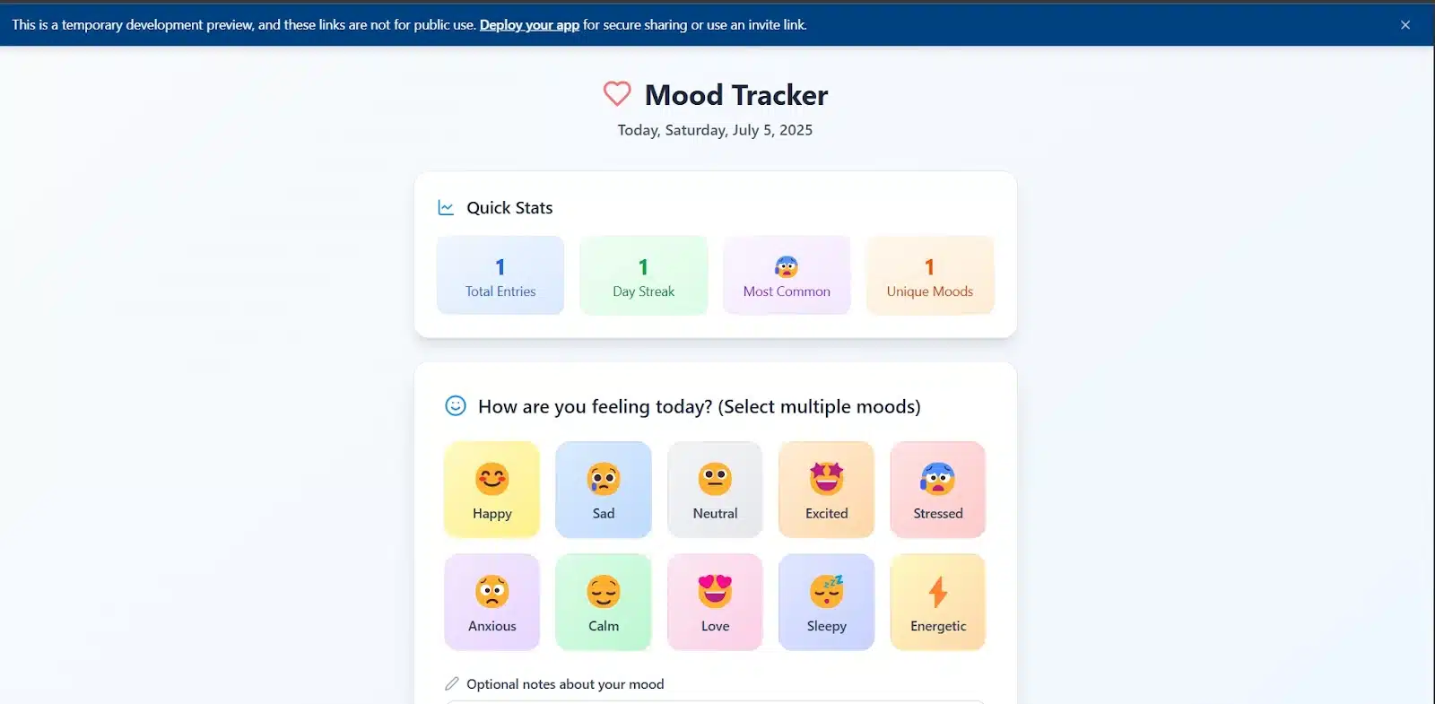
Then I tried logging new moods one by one again. Same issue: the new one still wiped the old one. So while it handled some of the changes, it didn’t fully solve the problem.
Overall, it was a strong start with good structure, clear feedback, and responsive UI. But the logic needed a second push and still didn’t fully hold up when tested deeper.
Mood Tracker on V0
V0 jumped straight into action. No plan, no breakdown. It just took the prompt and got to work. Less than two minutes later, I had an app. It looked okay. Not as bright or playful as Replit’s version, but more toned down, maybe even mature.
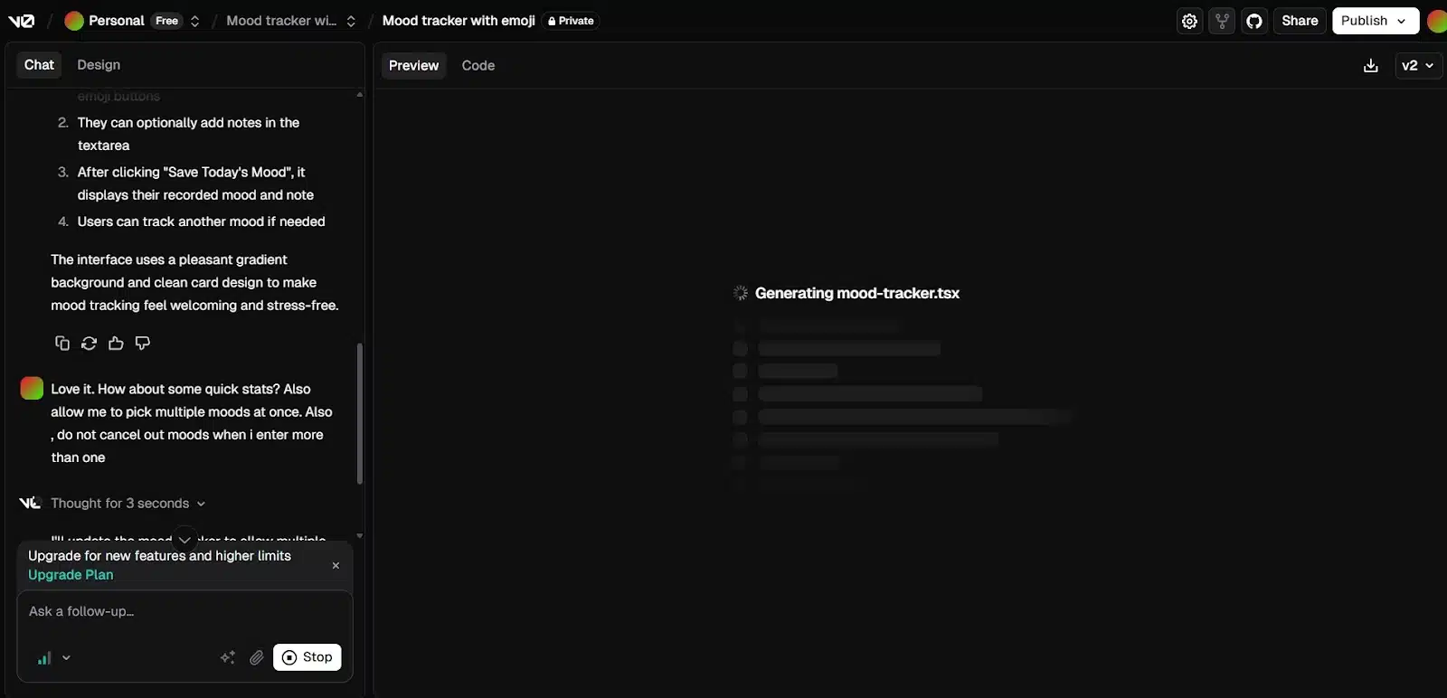
The interface had two main sections: mood selection and a textbox for notes. The list of moods wasn’t very diverse, and like Replit, it only allowed one selection at a time. I saved a mood, and it redirected me to another page with the saved entry. That part was impressive.
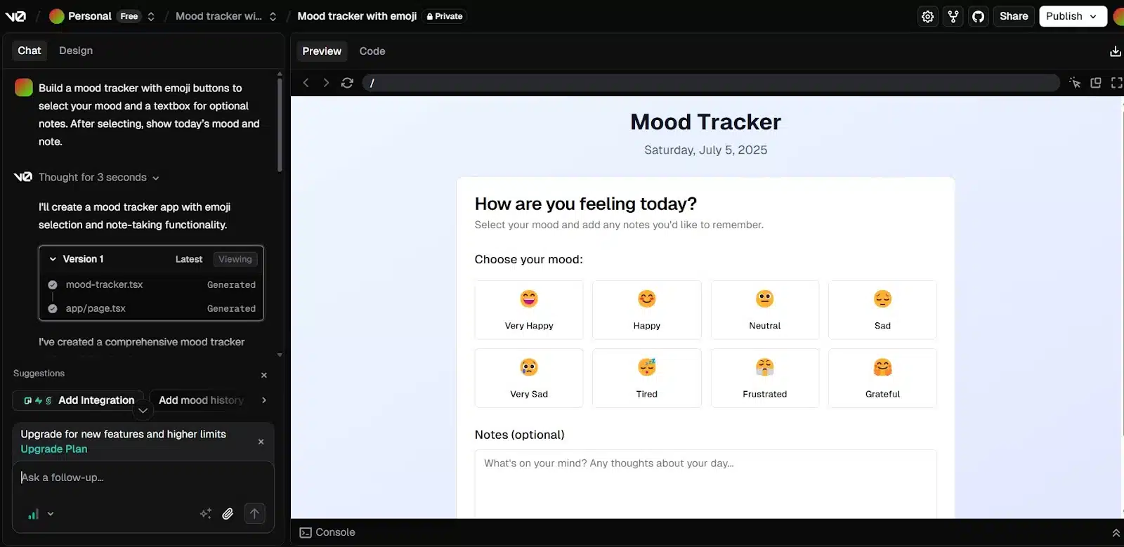
There was no back button, though. To return to the first screen, I had to click “Track another mood.” I tried logging another mood, but again, the new entry wiped the previous one—same issue as Replit.
So I gave it more instructions:
- Allow multiple mood selections
- Keep a list of all saved moods
- Show quick stats
It updated the code quickly. After that, I could select more than one mood at once. The second page now showed a list of saved moods alongside some basic stats. That looked promising.
But when I tested it again by logging moods separately, the previous one still disappeared. The mood list didn’t hold the full history, but the stats seemed to reflect all entries. For instance, it showed moods logged for two different days, even though the visible list only showed the latest one.
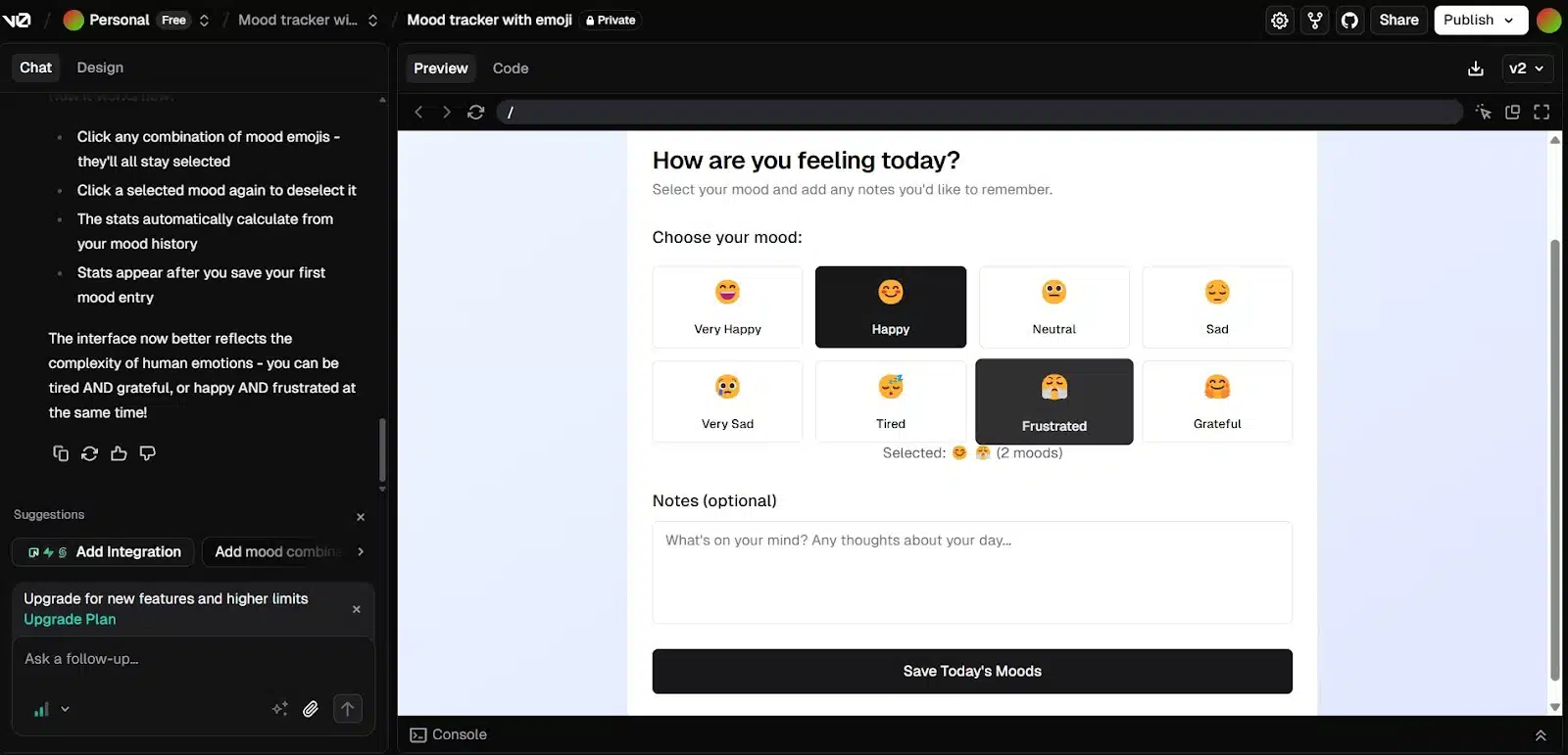
Overall, V0 responded quickly to changes and had a cleaner workflow. The UI wasn’t flashy, but it was well-structured. Still, like Replit, it struggled to keep a proper record of multiple mood entries.
App 2: recipe finder
Next up is something a bit more interactive. This app should let users search for recipes, filter by ingredients or meal type, and view the results as recipe cards. It’s not overly complex, but it adds more structure and logic than the mood tracker.
Prompt:
Build a recipe search app with a search bar, filters for ingredients and meal types, and recipe cards showing results.
Recipe Finder on Replit
I had high hopes for this one. It’s a recipe app so I expected something with warmth and color. Replit didn’t disappoint. It started with a plan and a preview, and honestly, I was sold. The layout looked clean, the colors were inviting, and it just felt like a recipe app should. I approved the plan right away.
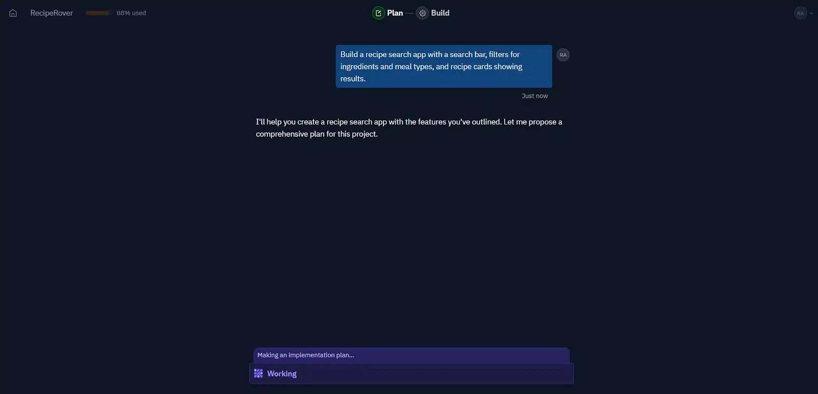
Once the app loaded, I noticed how smooth the layout was. It was easy to move around, and the filter options were generous. It catered to different diets and preferences—vegans, vegetarians, gluten-free, quick meals, breakfast, lunch, dinner, dessert. Replit clearly understood the assignment.
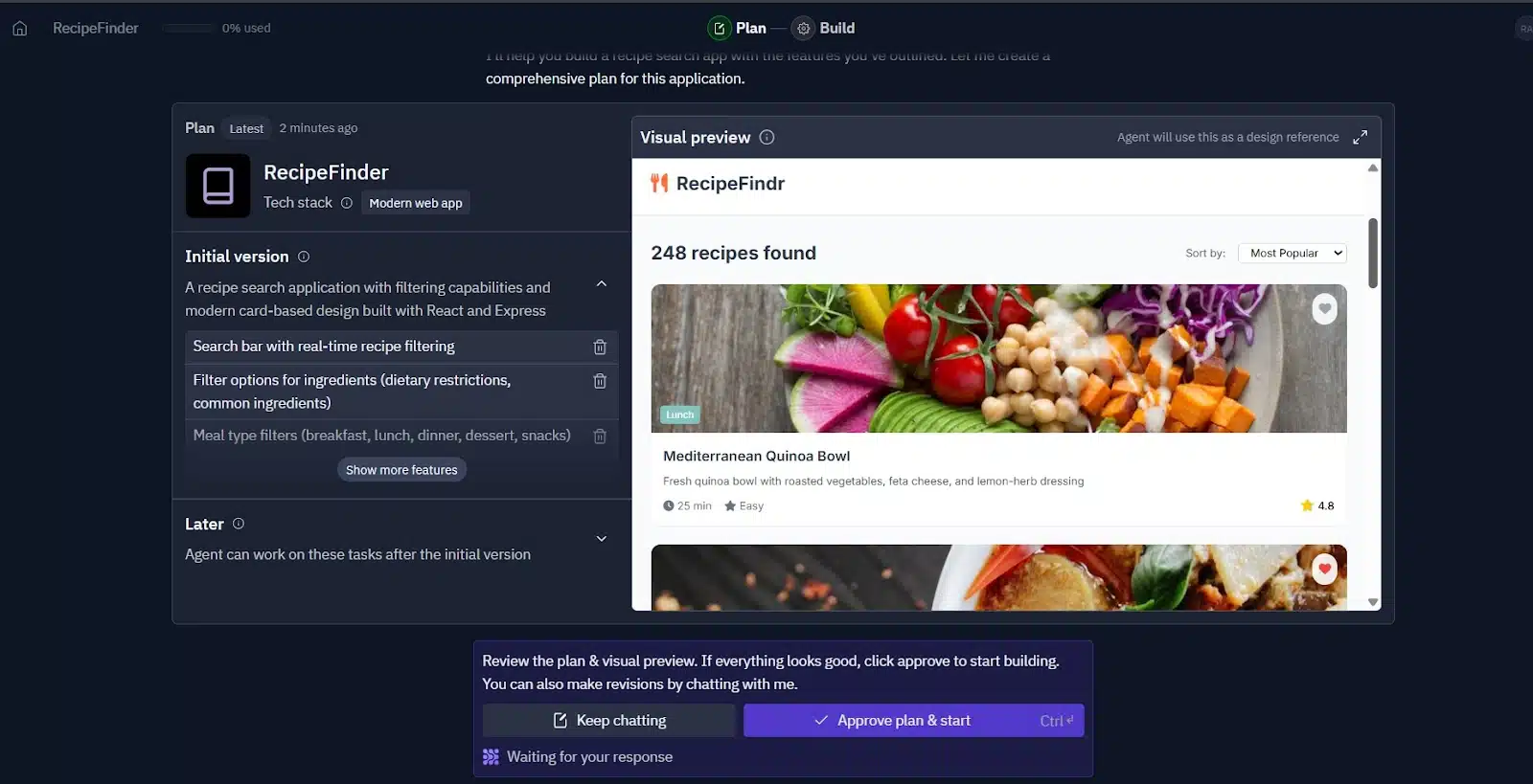
That said, the live version wasn’t exactly like the preview. The recipe cards I saw earlier didn’t come with any actual food data. There were no preloaded recipes. But that’s fair because it’s something that could be added later with a custom database or by feeding in content manually.
One thing to also note is Replit gave us a name again “RecipeFindr” which was not half bad.
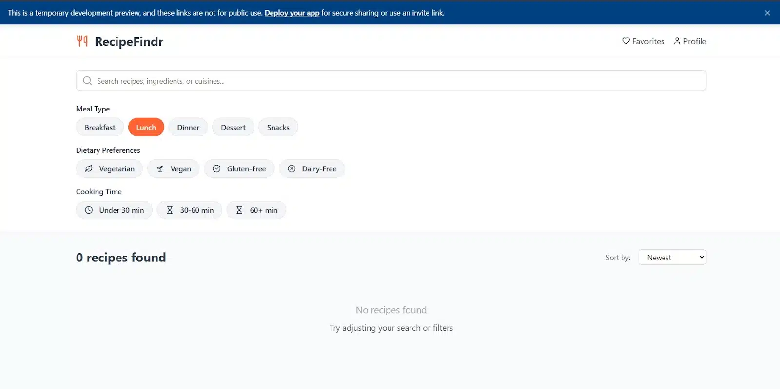
Overall, Replit nailed the design and structure. It gave me something well-organized, flexible, and very close to usable with just a bit of extra input.
Recipe Finder on V0
Things felt a bit dry on V0’s side. After I dropped in the prompt, it worked for about 90 seconds and gave me a black-and-white layout. Clean, but dull. It had that mature, no-nonsense dev energy and not in a fun way.
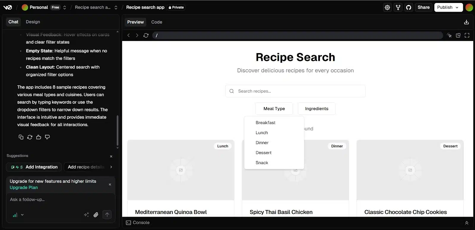
Filter options were there, but limited to ingredients and meal type. That said, V0 gave me something Replit didn’t: placeholders for actual recipes. There were eight in total, and when I filtered by “lunch,” it responded correctly. Filters worked well across the board, and there was a clear option to reset them too which Replit didn’t include, so I couldn’t test that part on its end.
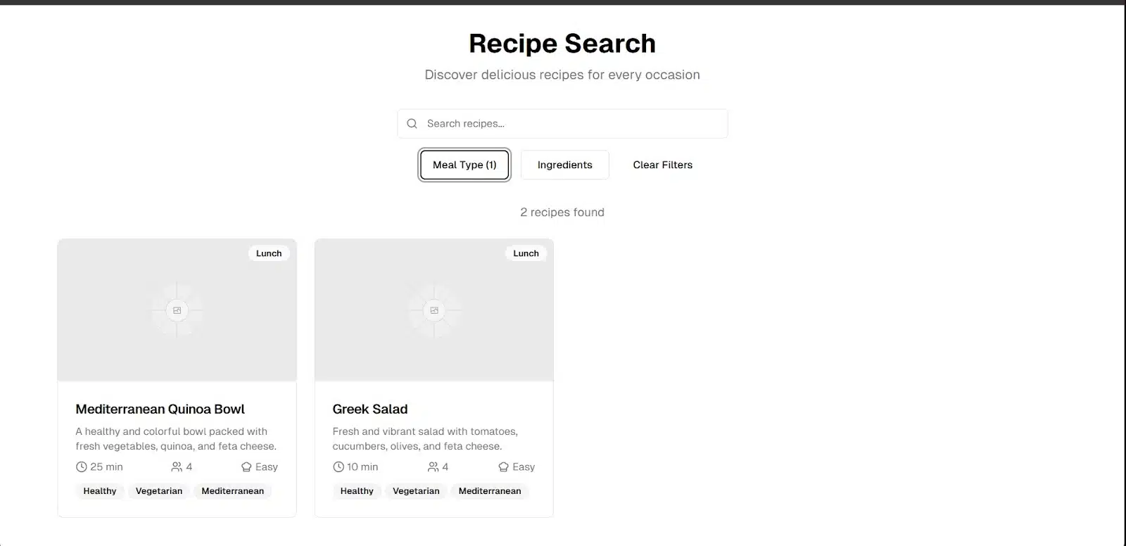
One thing I really liked: V0 added small keyword tags to each recipe; healthy, vegetarian, Mediterranean, Asian, spicy, quick, protein, classic. Subtle touch, but helpful. It gave each card some context at a glance, which felt more thoughtful than the visual design.
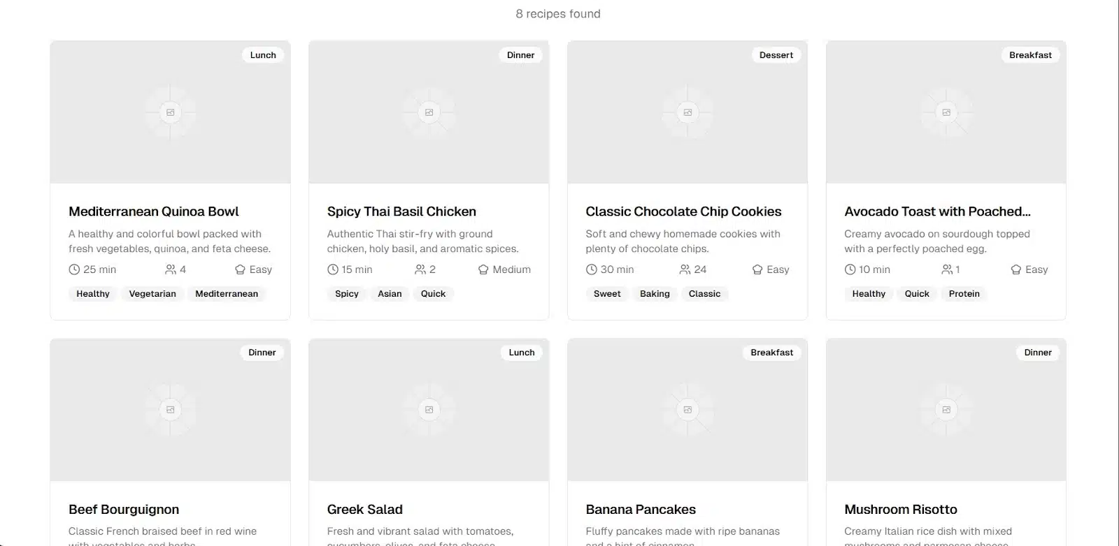
Overall, V0 was functional and handled filtering well. It didn’t have the polish or color Replit gave me, but it delivered on structure and useful extras that made the app feel a little more grounded.
App 3: budgeting dashboard
This one steps things up. The app should allow users to add new expenses through a form, sort them by category, and view a visual summary—ideally something like a monthly bar chart. It’s the most structured of the three and a good way to test how each platform handles logic, data, and basic visualization.
Prompt:
Build a budgeting app with a form to add expenses, category filters, and a bar chart that summarizes monthly spending.
This time, we will not stop at just one prompt. We will add one or two more to maximize whatever app is generated by the tools.
Budgeting Dashboard on Replit
Replit handled this one cleanly. The interface was simple, friendly, and gave me everything I asked for right out of the gate: a form to add expenses, category filters, and a working bar chart. It even added a section for recent expenses, which was a nice bonus.
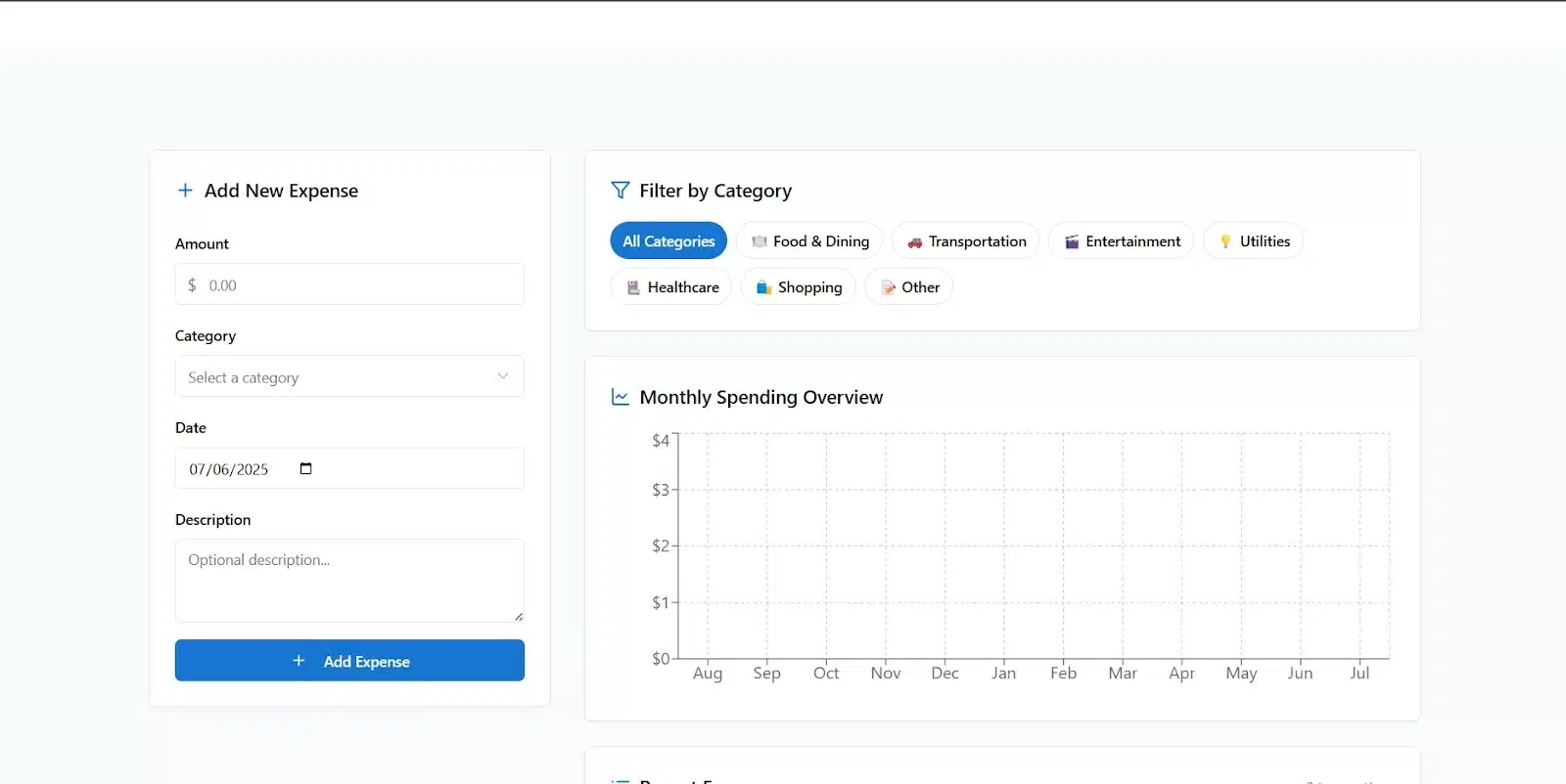
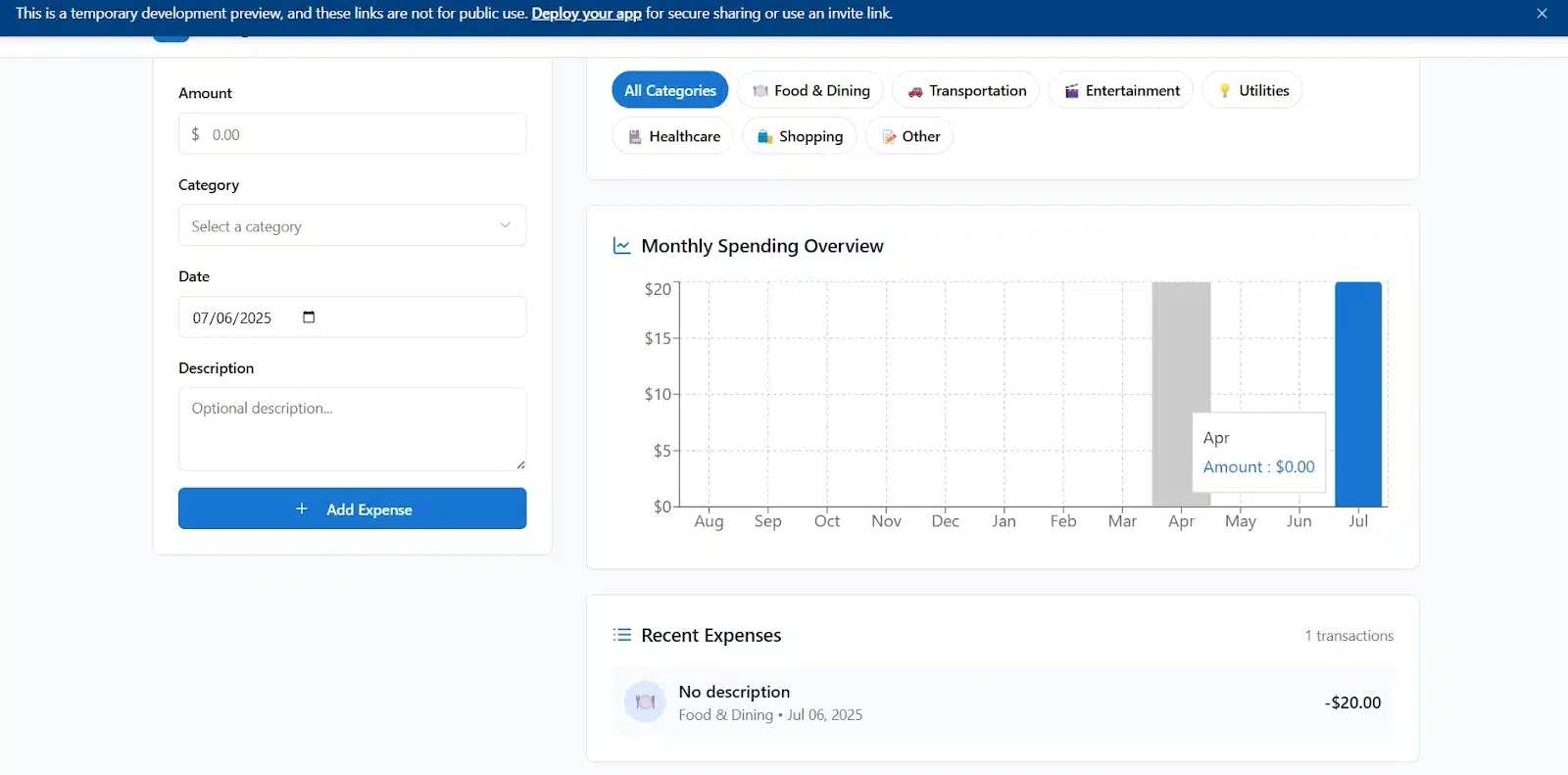
I tested the basic functionality by adding a few expenses. Everything went through smoothly and showed up where it should. So I pushed things further and asked Replit to add more features:
- A monthly budget limit with alerts
- A category breakdown showing how much was spent per category
- The ability to mark expenses as recurring
Here’s the prompt I added:
“Add a monthly budget feature that shows how much of the budget has been used. Include a category breakdown showing total spent per category. Also, allow users to mark expenses as recurring.”
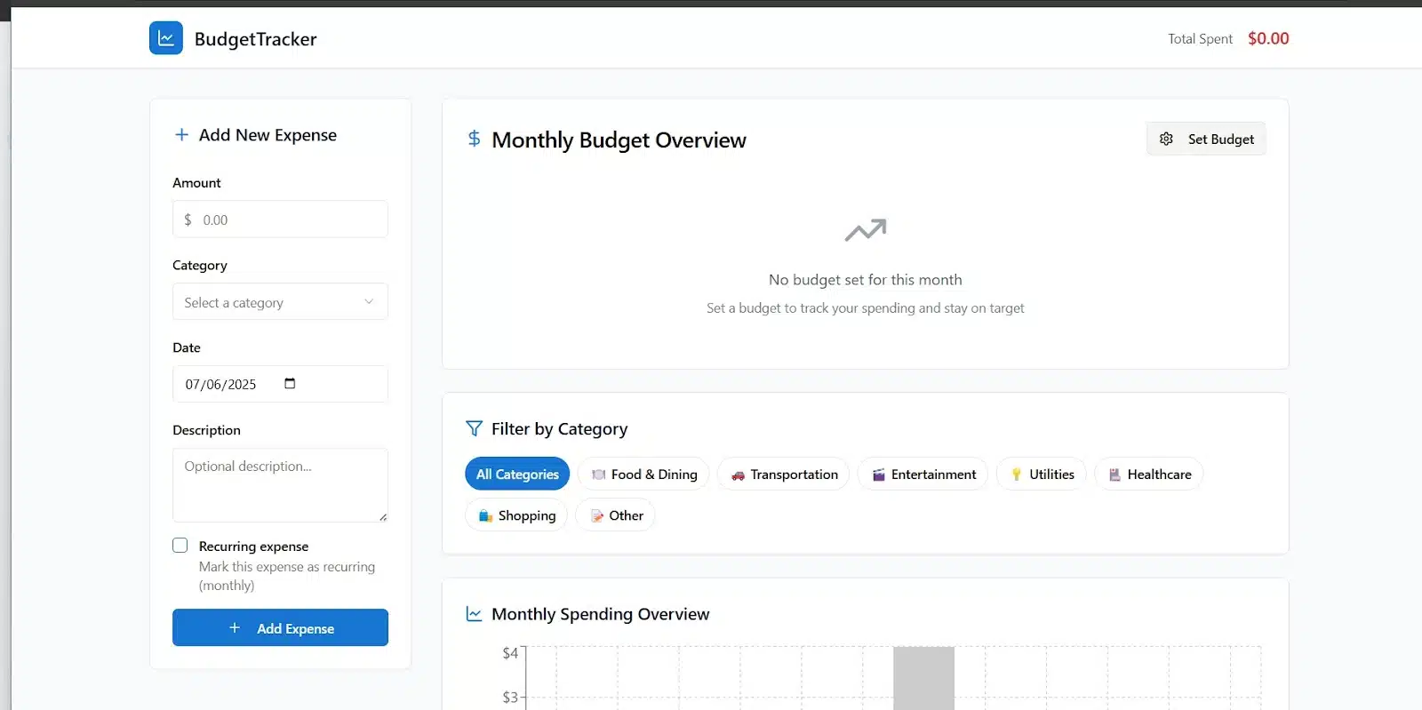
Replit got to work and delivered on the structure. I could set a monthly budget, and the interface adjusted to reflect it. I tried going over the budget in the healthcare category, but there was no alert. Then I went over the full monthly budget and finally got a warning: “You’re approaching your budget limit.” The message was late, since I had already crossed it.
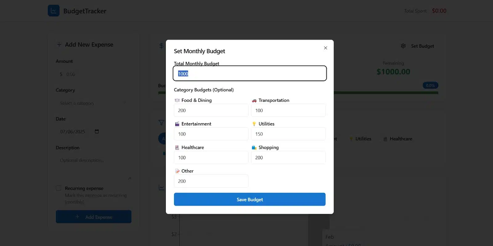
On the bright side, I could now tag expenses as recurring. That part worked well.
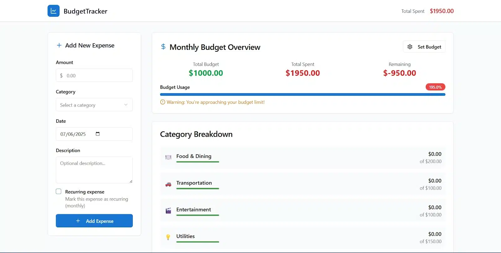
Overall, Replit responded well to additional features and kept the UI clean. The logic mostly worked, but the budget alert system needed better timing. Still, the app felt functional and expandable.
Budgeting Dashboard on V0
V0 gave me more this time. Right from the start, the dashboard felt complete. I could see my total expenses, current month’s spending, and a bar chart showing the monthly trend. It also let me filter expenses by category, and everything updated smoothly. When I added a new expense, the experience was seamless; it showed up exactly where it should.
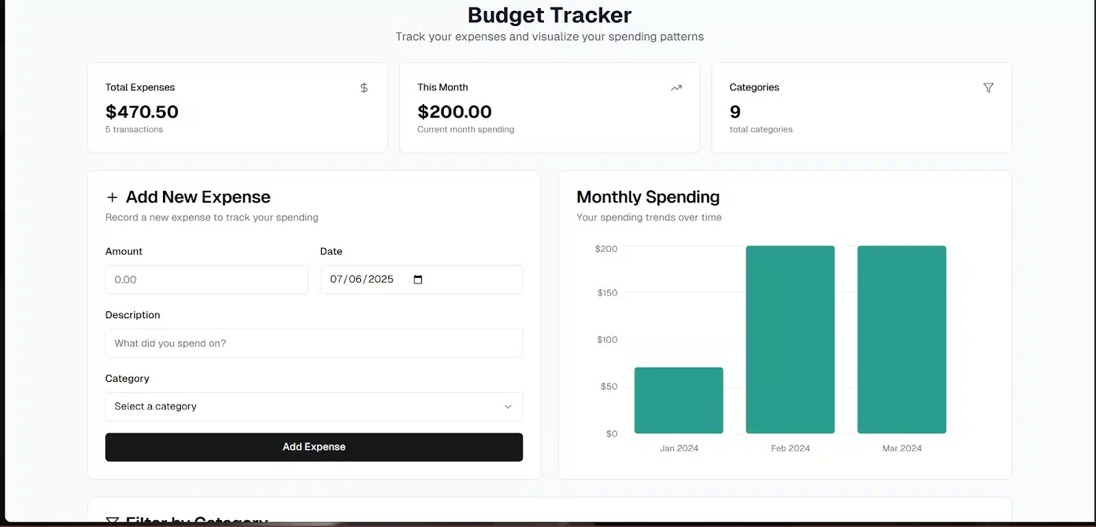
Then I added the same prompt I used with Replit:
“Add a monthly budget feature that shows how much of the budget has been used. Include a category breakdown showing the total spent per category. Also, allow users to mark expenses as recurring.”
Three minutes later, the app was updated, and it brought a lot with it. The summary section is now included:
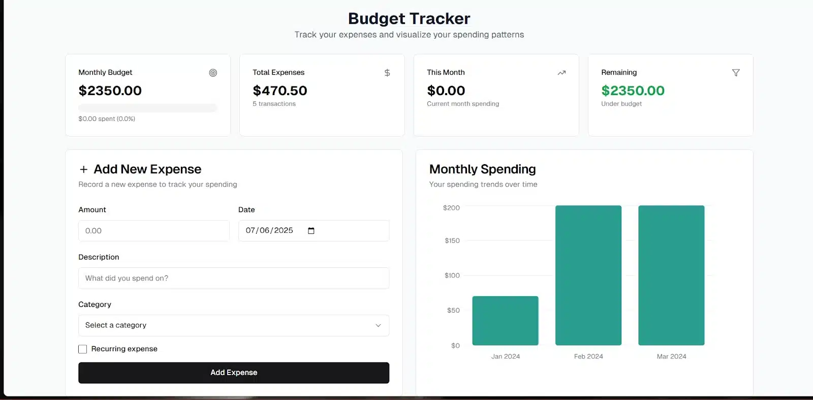
- Monthly budget
- Total expenses
- Current month spend
- Remaining budget
There was also an option to tag recurring expenses, and it worked without issues.
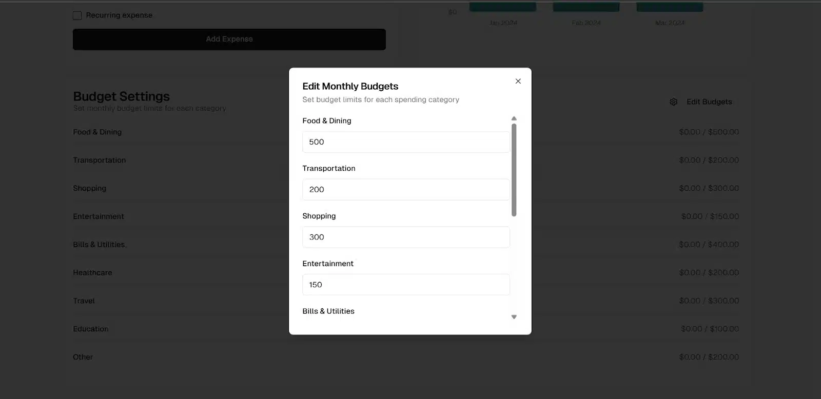
One standout addition was the ability to edit budget limits per category. I tested it, and it responded accurately. Even better, V0 added a category breakdown section with a pie chart. It showed how much each category contributed to overall spending, making it easy to see where the money was going. A genuinely smart and useful touch.
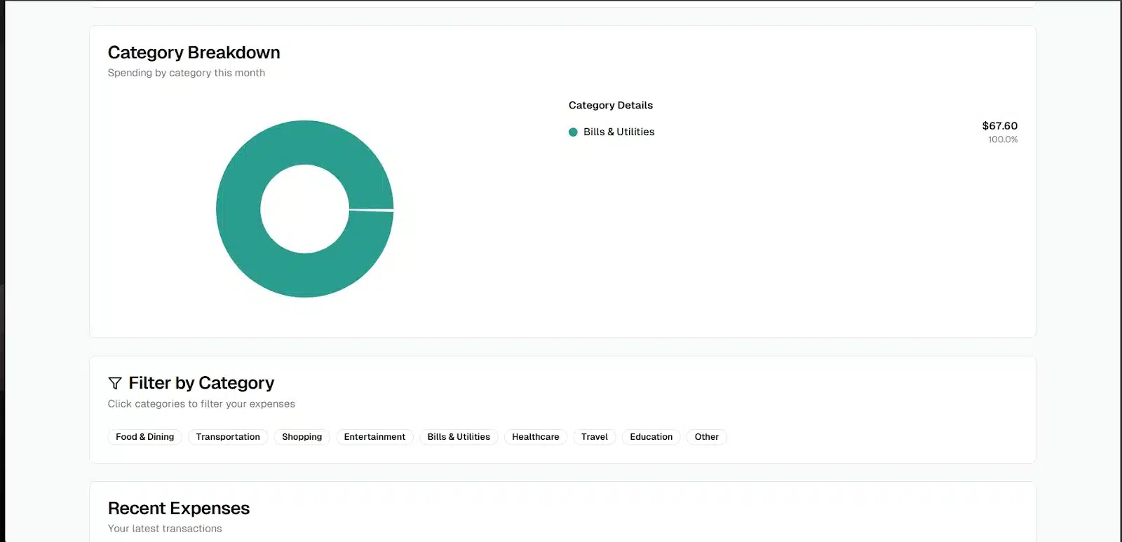
Overall, V0 handled the advanced features well. The layout was solid, the logic held up, and the pie chart brought some visual clarity that Replit didn’t include. It wasn’t flashy, but it was thoughtful and effective.
Replit vs V0: Side-by-Side Comparison
| Features/category | Replit | V0 | Winner |
| Setup Experience | Starts with a plan and preview before generating the app. | Generates immediately—no plan or preview. | Replit |
| Visual Design | Bright, friendly UI with a lively feel. | Minimalist, monochrome, more mature-looking. | Replit |
| UI Flexibility | Visually engaging but sometimes not as structured. | Clean layout, well organized, easy to scan. | V0 |
| Mood Tracker Outcome | Needed follow-up to allow multiple moods, but still replaced earlier ones. | Also, did not allow multiple moods until after the second prompt, same overwrite issue. | Tie |
| Recipe Finder Outcome | Nice filters, good design, but lacked sample data. | Functional filters, recipe placeholders, keyword tags. | V0 |
| Budgeting Dashboard Outcome | Delivered all key features + recurring toggle, but alerts were off. | Handled logic well, added pie chart, editable categories, strong layout. | V0 |
| Follow-up Prompt Handling | Responds well but sometimes misses logic details. | Quick updates and more accurate execution. | V0 |
| Data Visualization | Basic bar charts only. | Bar and pie charts with good labels. | V0 |
| Speed of Generation | Slower on first loads; ~2–3 mins. | Faster initial results and edits; ~90s–3 mins. | V0 |
Winner Overall
- V0 takes the win in most technical areas, especially for structure, data handling, and follow-up accuracy.
- But Replit still stands out for first impressions, design, and beginner-friendliness.
Final Thoughts
Both tools did well, but in different ways.
Replit does really well in presentation. It feels more welcoming from the jump, especially for casual builders or anyone who wants something clean and visually inviting. Its step-by-step plan and preview make you feel like you’re in control, and the designs often look better out of the box.
V0, on the other hand, felt more structured. It’s not trying to wow you with color, it’s focused on functionality. It handled logic-heavy prompts better, gave clearer data visuals, and was quicker to adapt when I asked for extra features. The pie chart, category editing, and smart tags stood out.
If you’re just vibe coding to bring a fun idea to life, Replit makes the process feel friendly. But if you care more about control, clear structure, and getting deeper functionality faster, V0 might be the better fit.
Either way, both platforms are getting better fast and this won’t be the last time I test them.
Have you tried Replit or V0 yet? Let me know what your experience was like in the comments. And if you haven’t used either, which one are you thinking of trying first?
You May Also Like
| Best Cursor AI alternatives | Claude vs GitHub Copilot |
| Best AI for Python coding | Tech skills to learn without coding |
| Github Copilot vs Cursor |

