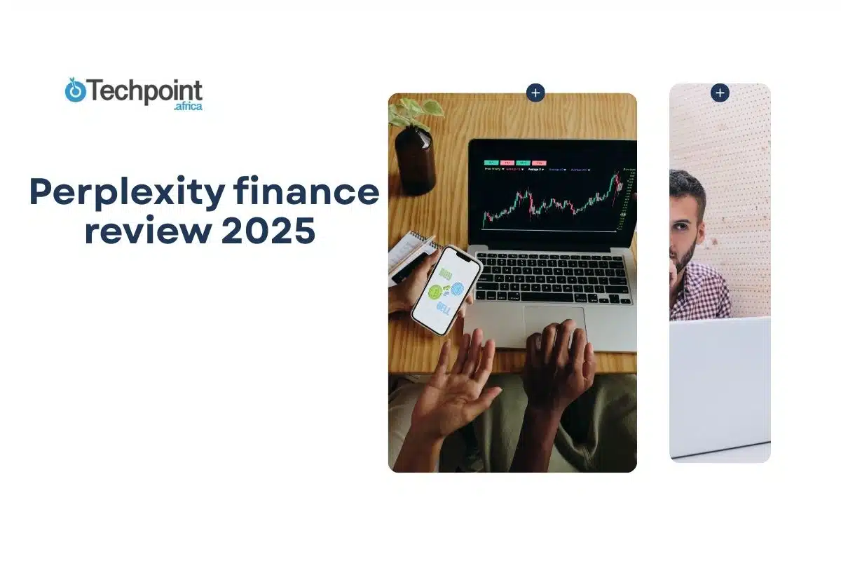


I didn’t plan to test another finance tool. But while using Perplexity for general research, I noticed its Finance tab quietly offering stock quotes, earnings summaries, and SEC filings, all tied to AI-generated answers. That got my attention.
Most AI tools aren’t built with investors in mind. They’re either too shallow, too vague, or lag behind real-time data. So I gave this one a proper test, not just to see if it could answer basic stock questions, but to find out if it could handle actual market research.
This review is a breakdown of what I found: the good, the frustrating, and where it might actually fit in a serious investor’s workflow.
What perplexity finance is and what it claims to do

Perplexity Finance is a dedicated section within the broader Perplexity AI platform, a research assistant powered by large language models, specifically designed for financial data. Unlike traditional AI chat tools, this one connects directly to real-time market data and public filings. It’s like a search bar that understands financial context, pulls up live numbers, and explains what they mean, instantly.
It covers:
- Stock quotes and charts (updated live)
- Earnings reports and analyst forecasts
- SEC filings and company disclosures
- Peer company comparisons
- AI-generated summaries of financial documents and market events
All of this lives inside the Finance tab, which you can access directly at perplexity.ai/finance or by entering a query like “AAPL earnings” in the main search bar. Perplexity then returns a structured view of the company’s financials, along with a readable explanation and clickable sources at the bottom.
The tool is powered by Financial Modeling Prep (FMP) for raw data and uses models like GPT-4 or Claude (for Pro users) to generate responses. The idea is to cut through spreadsheet overload and provide you with insights in seconds without losing trackability.
It’s not trying to replace a Bloomberg Terminal. However, it is positioning itself as something lighter, faster, and far more accessible, especially for independent investors and analysts who want structured answers without having to dig through PDFs or toggle across five browser tabs.
First impressions: setup and user interface
I didn’t need to sign up or install anything complicated to try Perplexity Finance. I just opened perplexity.ai and clicked into the Finance tab. Right away, I was in the finance corner with just a clean search bar and a handful of featured tickers underneath.
Typing a stock symbol or company name gives you an instant snapshot:
- A small stock chart
- Key financial metrics
- Latest news and earnings summaries
- Peer companies
- And an expandable section labeled “More about [company]”
Everything loads in a few seconds. The speed genuinely stood out, especially for anyone used to clunky dashboards.
The UI is minimal but structured:
- Text answers on the left
- Data tables and charts embedded where relevant
- All sources clearly linked at the bottom of each answer
You can follow up with natural questions like “What caused the drop in April?” or “Compare AAPL to MSFT,” and Perplexity will continue the thread without losing context, similar to a chat, but tighter.
Mobile experience? Surprisingly good. I ran a few stock queries on my phone and didn’t feel boxed in. Everything resizes smoothly, and the core features are still accessible.
In short, Perplexity Finance doesn’t overwhelm you with options. It feels built for looking up what you need now, not tinkering with a bunch of filters or dashboards. That might be a downside for deep quant workflows, but as a fast research assistant? So far, it’s promising.
Putting it to the test: my hands-on experience with real stocks
It’s one thing to read about features; it’s another to see how they hold up under real use. So I ran a few stocks through Perplexity Finance to see how well it could handle actual market research. No cherry-picked examples, just companies I already follow and analyze regularly.
I wanted to know:
- How fast and reliable is the data?
- Can it surface useful insights without me digging?
- And most importantly, would I trust the output enough to use it in real decision-making?
Here’s what happened when I used Perplexity to research real stocks, earnings, news, ratios, and everything in between.
Stock Test #1: Tesla (TSLA)
The Prompt I typed was, “Tesla stock.” I was looking forward to the following:
- Real-time price and movement
- Earnings summary
- Financial metrics
- News context
- Opportunity to follow up with a deeper analysis
What perplexity gave me

Perplexity returned a clean, structured breakdown of Tesla’s stock, starting with the current share price and a live trend chart. Below that, it listed key stats like:
- Previous close
- Opening price
- Market cap
- Day range
- P/E ratio
- Dividend yield
- And a few more core metrics
It also added a short text summary, noting Tesla’s current price, its daily high and low, and a sentence about market movement. After that, it gave a brief background on the company, including what Tesla does, its leadership, and how many people it employs.
Was it useful?
Yes, for a quick snapshot, this was solid. Everything loaded fast, and the metrics were all clearly labeled. The price and chart felt accurate and up to date. The follow-up description didn’t feel like fluff. It was a concise recap of Tesla’s current standing and company overview.
The layout made it easy to skim, depending on how much time you had. If you’re mid-research and just need high-level numbers without toggling between five tabs, this definitely gets the job done.
I then followed up with: “What caused Tesla’s revenue to decline in Q2 2024?”

Perplexity responded with a short but accurate summary of the key reasons behind the drop in revenue. It was a concise breakdown that was easy to understand, with the facts pulled from credible sources, presented clearly.
For earnings-related context, this kind of instant response is genuinely helpful. It’s the kind of follow-up that could easily take 10–15 minutes of manual searching elsewhere, compressed into a single click.
Stock Test #2: Nvidia (NVDA)
Next prompt I typed: was “Break down Nvidia’s Q1 2024 earnings performance.” I expected:
- A clear, summarized explanation of Q1 results
- Key revenue drivers and margin trends
- Any mention of forward guidance or market reaction
- Something I could use to build a quick case for or against the stock in my notes
What perplexity gave me:

The response was structured and easy to digest. It included:
- Nvidia’s total Q1 revenue with a year-over-year growth percentage
- Commentary on which segments drove growth, specifically the data center and AI GPU divisions
- Notes on net income, profit margins, and record-breaking quarterly figures
- A quick mention of CEO commentary and market reaction
Sources were cited at the bottom, including investor calls and news coverage. The tone was balanced, not overly bullish, but clearly reflecting the strong results.
Was it useful?
Yes, it delivered exactly what I was hoping for: a concise earnings breakdown without having to dig through the official press release. The highlight on data center revenue and AI-driven demand lined up with what you’d expect to find in the actual earnings call transcript, just faster.
This kind of summary works well when you’re doing quick comps across tech stocks, prepping for earnings season, or flagging standout metrics in a portfolio review. For speed and clarity, it nailed it.
Bonus Prompt I Tried:

“What is driving Nvidia’s long-term valuation growth?”
The follow-up gave a high-level view of:
- Nvidia’s strategic role in the AI hardware ecosystem
- Its moat around proprietary GPU tech
- The expansion of its data center footprint
- Market optimism around sustained AI demand
The summary didn’t go too deep into financial modeling (which is fine, that’s not its job), but it did provide the kind of overview you’d expect from a junior analyst briefing.
Stock Test #3: JPMorgan Chase (JPM)
Lastly, I wanted to see how it fared in giving quality info investors could use. So, my next prompt was “Summarize JPMorgan’s Q2 2024 earnings and key takeaways for investors.” I wanted to see if it could give me the following without more prompts:
- A clean summary of JPMorgan’s financial performance
- Segment-level highlights (e.g., consumer banking, investment banking, credit trends)
- Forward guidance or CEO commentary
- Any red flags or positive indicators investors should note
What perplexity gave me
The response opened with total revenue and net income figures for Q2, followed by a breakdown of what contributed to performance:
- Net interest income remained strong, driven by higher interest rates
- Consumer banking showed growth in deposits and spending
- Investment banking was mixed, with some softness in dealmaking activity
- It flagged credit loss provisions, which had increased, signaling some cautious positioning
The AI also mentioned Jamie Dimon’s comments from the earnings call, noting the bank’s conservative stance amid macro uncertainty.

It closed with a quick bullet list of investor-facing insights, like capital strength, dividend updates, and regulatory headwinds.
Citations linked to the Q2 press release and major outlets covering the earnings.
Was it useful?
Yes, it gave me a full snapshot in under a minute. The structure was helpful: financials up top, segments next, and investor takeaways at the end.
The mention of rising credit provisions was particularly useful. That’s the kind of thing you’d want to flag if you’re watching for early signs of consumer softness or shifting risk exposure.
This saved me from combing through the full earnings PDF or hunting for post-call summaries. For investor use, it’s a solid time-saver.
Features that stood out during testing
After running my prompts across Tesla, Nvidia, and JPMorgan, a few features consistently stood out, not just because they worked, but because they actually added value to the stock research process. Here’s what impressed me most:
- Structured, real-time snapshots
Each stock search delivered a clean, readable summary of key financials, live pricing, P/E ratios, volume, dividend yield, and market cap, without requiring me to piece together data from different screens. The trend charts are basic but load fast and give a good quick visual.
- Earnings breakdown that saves you time
Typing “Q2 earnings” for any stock brings back an immediate overview of performance, including revenue, profit, business segment details, and even management commentary. It felt like having the press release distilled into a single paragraph. This alone shaved minutes off my normal workflow.
- Follow-up prompts that actually work
After viewing the base result, I asked natural-language follow-ups like:
- “What caused the revenue drop?”
- “What’s driving valuation growth?”
- “What are the investor takeaways?”
Perplexity handled these with context-aware answers, often pulling from the company’s own reports and linking to sources. The ability to explore deeper questions without resetting the thread was a major win.
- Inline citations and verifiable sources
Every summary comes with links at the bottom, typically to SEC filings, earnings reports, or reputable financial news outlets. That level of transparency helps you trust what you’re reading, and it’s something not every AI tool gets right.
- Fast response time and zero clutter
Unlike traditional research dashboards, there’s no waiting around, no account setup delays, and no advertising noise. The answers arrive in seconds, even for complex prompts. And the minimalist layout keeps the focus on the content.

What could be better
While Perplexity Finance does a lot right, there are still some areas where it falls short, especially if you’re relying on it as part of a serious research workflow. Here’s what stood out:
- Summaries can be too brief for complex questions
The earnings recaps and revenue explanations are helpful, but sometimes feel one paragraph too short. If you’re looking for deep context, like operating margin breakdowns, historical comparisons, or FX impact, you’ll likely need to dig into the source links anyway. It’s fast, but not always deep.
- No chart customization or historical data tools
The trend charts are static and basic; they don’t let you zoom into custom date ranges, compare multiple stocks, or overlay technical indicators. If you’re used to working with platforms like Koyfin or TradingView, this feels like a step down in terms of visual data interaction.
- No industry-specific metrics
Perplexity gives broad financial ratios, but it doesn’t go deep into sector-specific data. For example:
- Banks: no breakdown of net interest margin or CET1 ratio
- Tech: no mention of R&D spend or segment-level margin
- Retail: no same-store sales or inventory turnover
This limits how far you can go without opening other tools.
- International coverage is still limited
If you’re analyzing non-US stocks, the tool starts to wobble. Some tickers don’t load cleanly, and the financial data can be spotty. It’s clearly optimized for US-listed companies right now.
- No alerts, export, or watchlist features
There’s no way to “track” a company, export your findings, or set up alerts. If you’re hoping to build out a research workflow inside Perplexity Finance, you’ll find it limited. It’s great for on-demand questions, but not yet a full portfolio research tool.
So while it’s excellent for fast, clean answers, it’s not trying to be a full equity research suite, at least not yet.
Free vs pro: what you get and what’s worth paying for
Perplexity offers both Free and Pro tiers, and the difference starts to matter once you push beyond surface-level queries, especially in finance.
Here’s what I experienced with both:
The free plan: surprisingly generous (but capped)
With the free version, you get:
- Access to the Finance tab
- Real-time stock data, charts, and financial metrics
- Basic earnings summaries and AI-generated responses
- Source links at the bottom of every answer
- A few follow-up questions per session
In short, you can get a solid amount of stock research done without paying anything. If you’re looking up a few companies a day and asking straightforward questions, you won’t hit the wall too quickly.
The pro plan: designed for power users
With Pro (as of now, $20/month), you unlock:
- Access to multiple AI models like GPT-4, Claude 2, Claude 3, Sonar
- Faster, more detailed responses
- Priority access during peak times
- Longer and more complex follow-up threads without getting rate-limited
- Better formatting for structured answers (bullet points, tables, etc.)
If you’re:
- Asking multi-layered questions like “Compare 3-year margin trends for NVDA, AMD, and INTC”
- Running back-to-back follow-ups in the same session
- Relying on Claude 3 or GPT-4’s better summarization capabilities
…then Pro starts to feel essential.
My take
If you’re doing casual stock lookups or just testing the waters, the free version is more than capable. But if you:
- Work in finance professionally
- Run research-heavy workflows
- Like to dig deep into filings or compare multiple companies
The Pro plan gives you room to breathe. For $20/month, it’s a cheap assistant compared to traditional finance tools.
That said, even with Pro, it’s still a research companion, not a full portfolio analysis platform. But it’s growing fast.

Final verdict: will i keep using Perplexity Finance for stock research?
Perplexity Finance isn’t a one-stop solution for equity research and it’s not trying to be. But it handles a very specific job well. It’s quick, structured answers for stock-related questions backed by real-time data and cited sources.
In testing, it did a good job summarizing earnings, highlighting revenue drivers, and responding to follow-up questions with enough clarity to be useful. The watchlist feature makes it easier to track tickers you’re actively monitoring, and the inclusion of industry-relevant metrics (where available) shows that the product is evolving beyond just generic financial data.
That said, there are limitations:
- Summaries can be too brief for in-depth analysis
- Data visualization is basic
- It’s not ideal for building or tracking investment theses over time
Still, for quick research, earnings prep, or sanity-checking headlines, it’s effective, especially if you don’t want to bounce between Yahoo Finance, news sites, and company filings every time you look something up.
I’ll continue using it for lightweight research tasks and follow-up questions, but not as a replacement for more robust tools. It’s best suited as a support layer— one that’s fast, responsive, and getting better.
 11")

 13")


