Since it was birthed over 10 years ago, Nairaland has been on the rise, providing Nigerians with a place to call home online. The platform has three main categories/forums and about 32 sections that users can place various topics. The number one website/forum in Nigeria has seen increasing traffic over the years and has successfully shown online folks that Nigerians like to talk provided the medium of communication isn’t priced as gold.
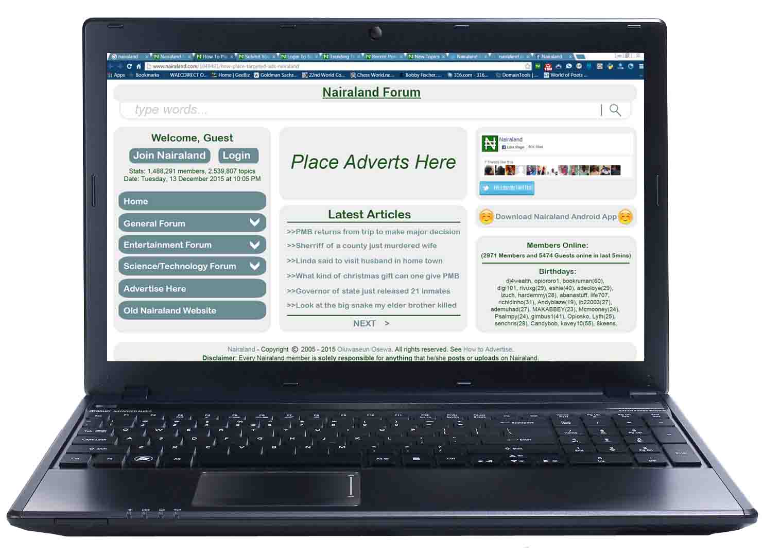
We aren’t sure if Seun Osewa, the founder of Nairaland has any plans to change the interface soon but we got these interesting designs from a Nairaland fan who wants to remain anonymous.

The interface still has that simple and straight-to-the-point feel you get when you visit the current Nairaland website but then the way sections/forums are displayed is totally different to what I am used to on Nairaland. Also, the new interface has that one page look with an impression that I don’t need to scroll to find most of the things I’m looking for while accessing Nairaland on desktop.
The mobile version tries to retain the desktop feel but doesn’t, the current interface has a unique approach of retaining it’s look on both desktop and mobile. The menu bar is observed from the design to slide out from the left and the social media icons are positioned below the menu list. I wouldn’t say anything yet about these designs because I still like the simplicity on the old interface but then the design reveals a link in the menu (Old Nairaland Website) that can take the user back to the current website.
I don’t know what to think right now, but I sure will like to know what you Nairaland fans and users feel about this in the comment section below.


