Barely a week after the social sporting app, Truppr's Design Challenge closed to submissions, the results were announced. The challenge which aimed at discovering new talent and also revamp the Truppr user interface, got 15 entries. The challenge focused on: the homepage, event listing page, single event page, Messaging and the login/signup page of Truppr’s web platform.
Not winning the design challenge means you get some benefits like Truppr design challenge tees, priority access to CodeCamp 2016 and priority access to design classes. While the winning candidates/teams which in this case are two individuals get $1000 with a Truppr hoodie (limited edition), Truppr design challenge tees and bragging rights.
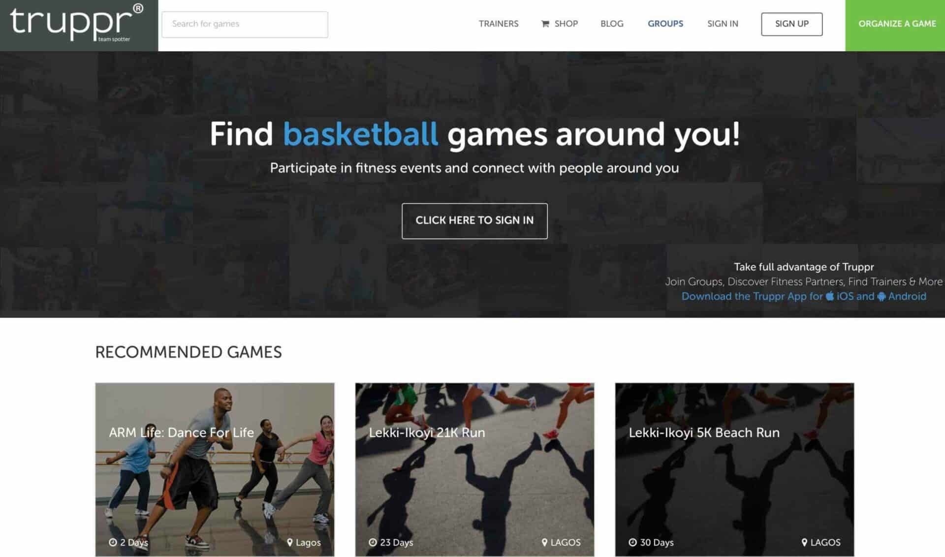
The two winners get to join the Truppr team in developing the new interface for the Truppr website and the other participants are now potential designers for openings in Co-creation Hub.
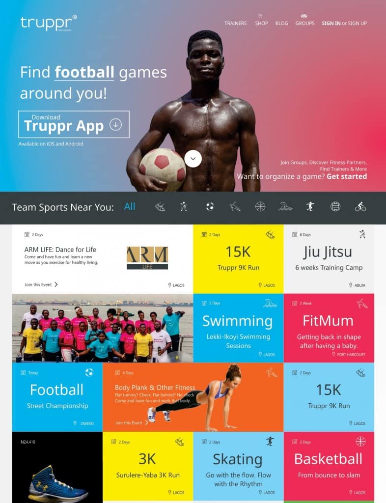
Gabriel Eze's concept, I must say reminds me of Microsoft's use of tiles for displaying apps on windows and it looks sleek. The SIGN IN/SIGN UP buttons aren't very visible as with the other menu items but the colour blend actually looks nice.
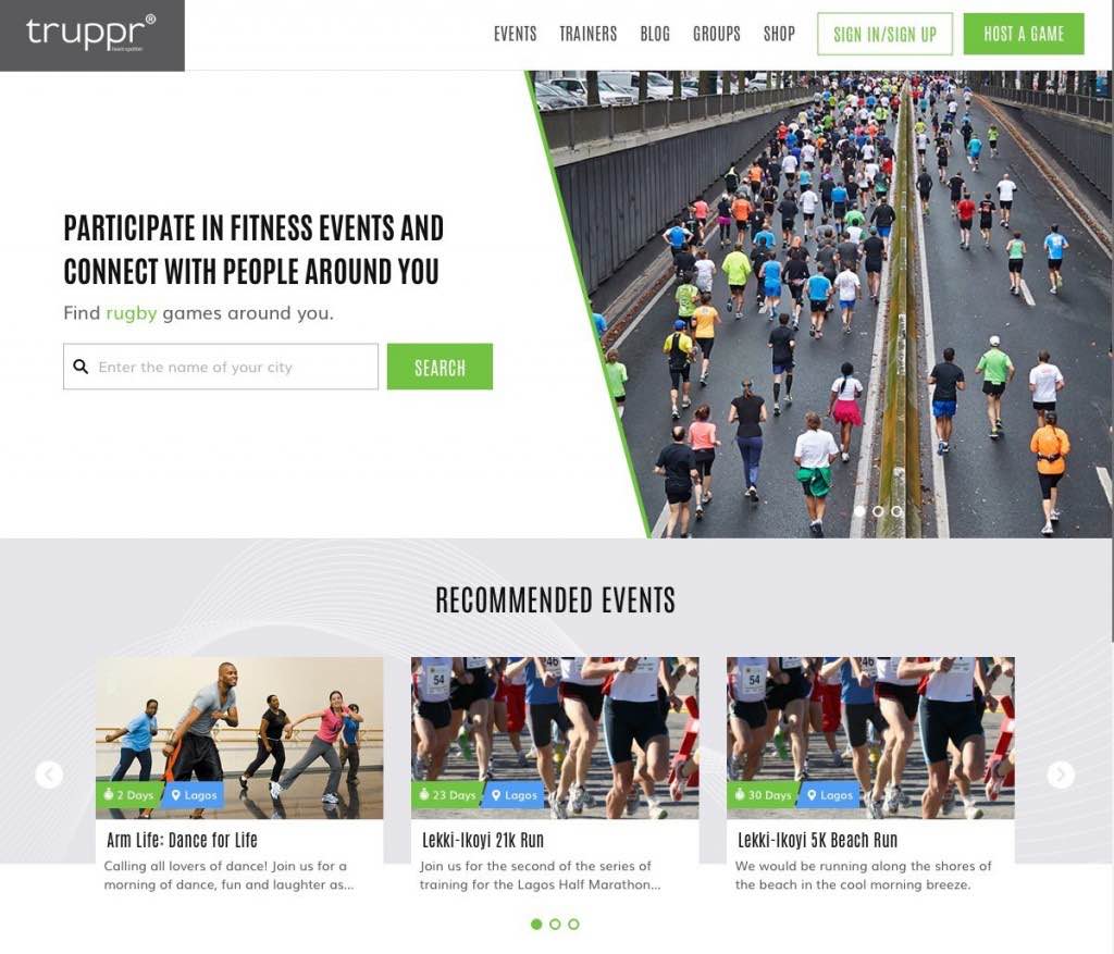
Imogie Mubarak, the second winner of the Truppr design challenge had a different take with a design that emulates a lot of the current design on the Truppr website and I totally agree with the repositioning of the search box.
Big congrats to Gabriel and Imogie on winning the challenge and it further shows to all that we got talents that need to be discovered. Hopefully we will see more organisations host design challenges to discover the design gurus buried behind their laptops and graphic tablets.
I am eager to see what the duo will come up with as a final template for Truppr, the blend of the two designs can actually present a killer interface that is sleek and user friendly. Until then, let us know what you think of the two winning designs.

Be the smartest in the room
Give it a try, you can unsubscribe anytime. Privacy Policy.

